Taleggio
Foundry
Independent foundry.
Typefaces, made slowly.
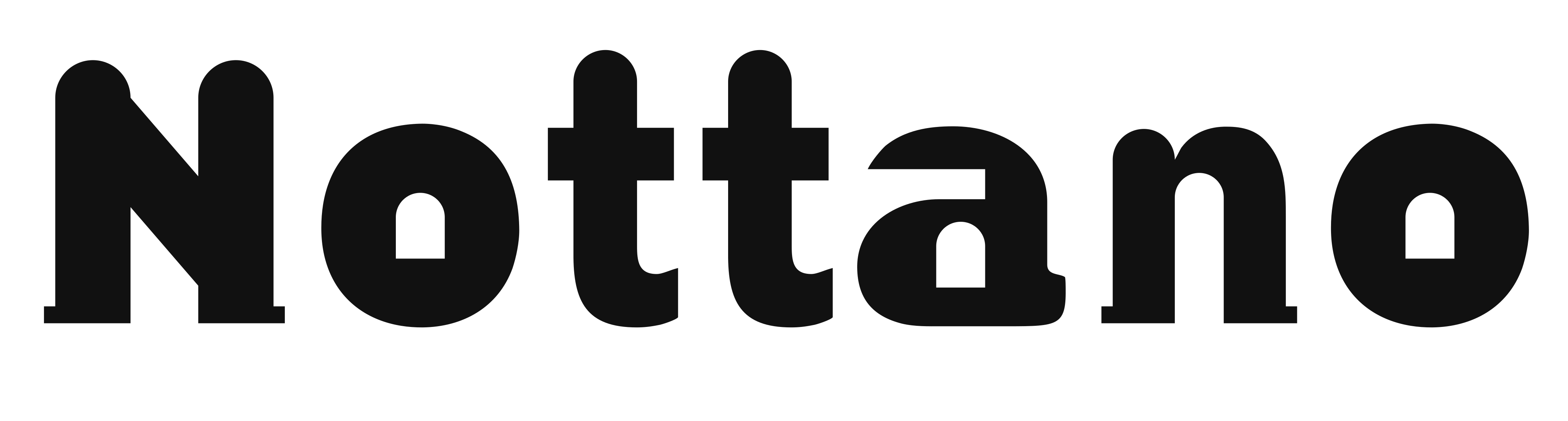
A display sans in three styles, for posters and covers.
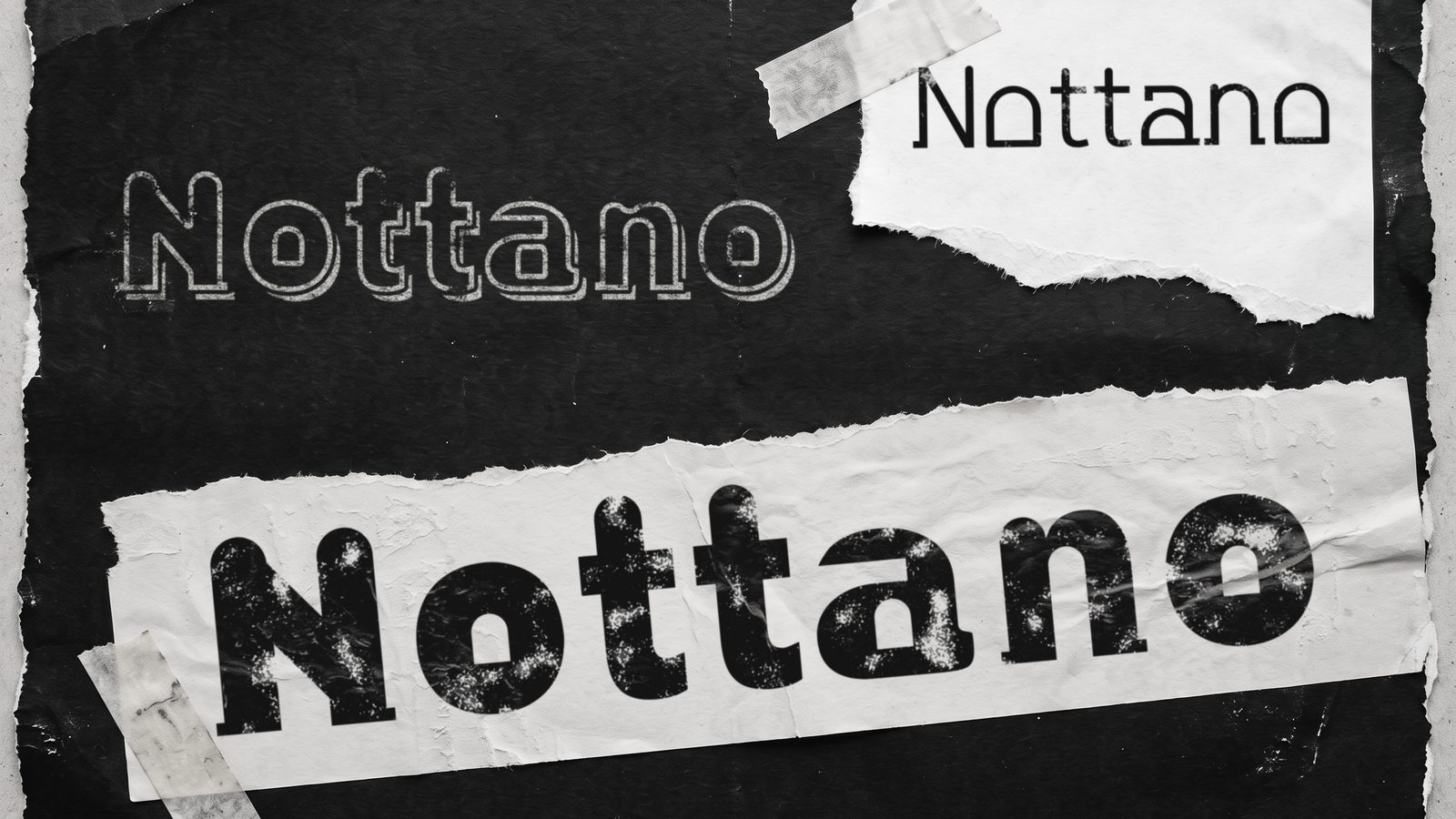
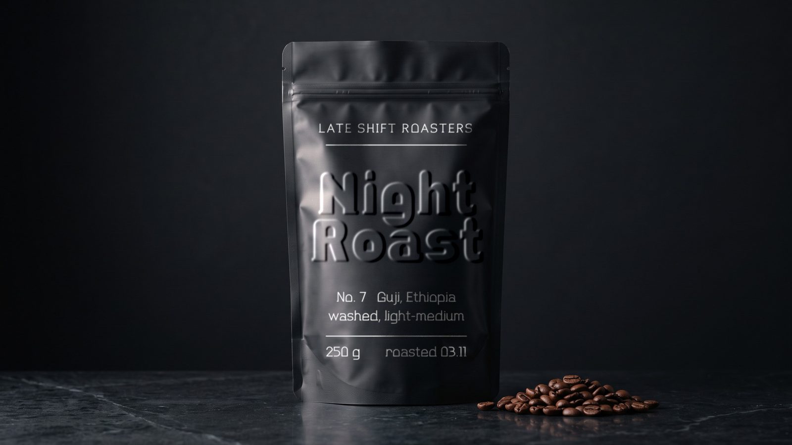
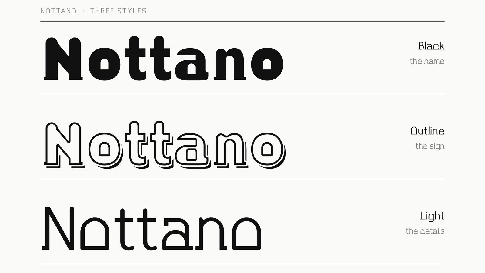
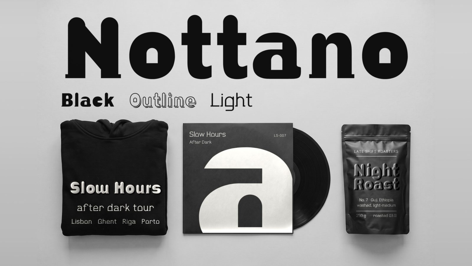
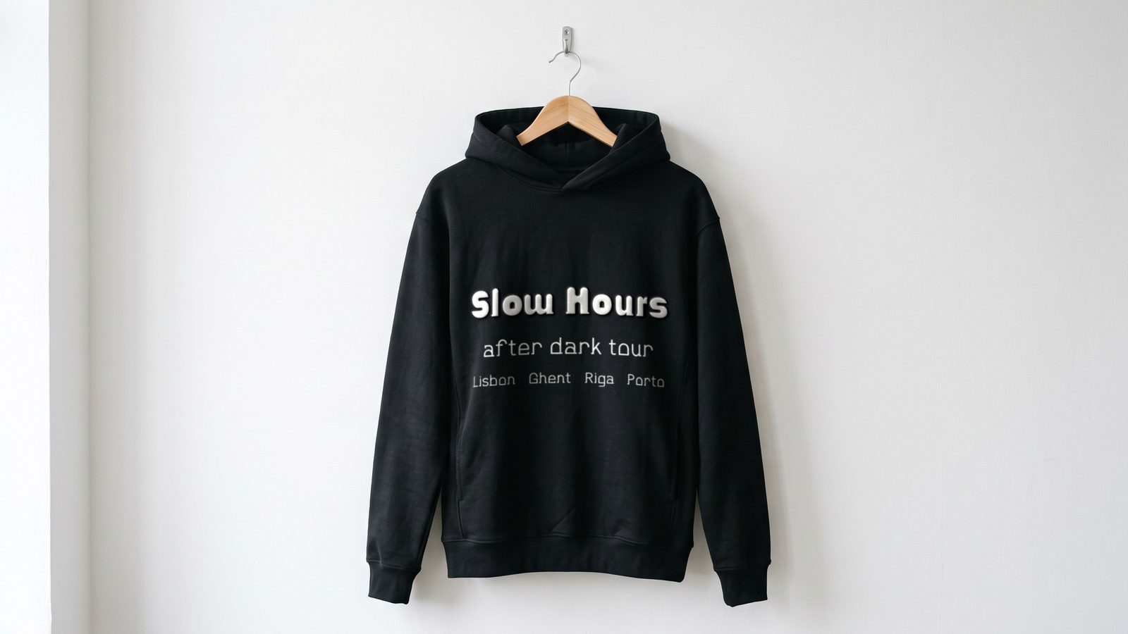
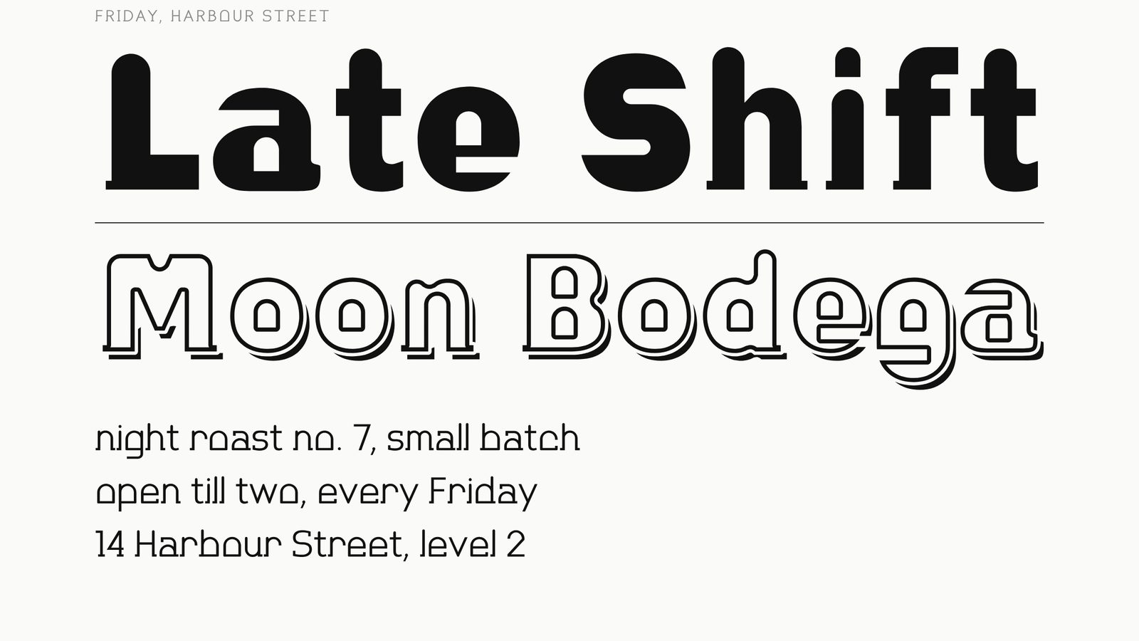
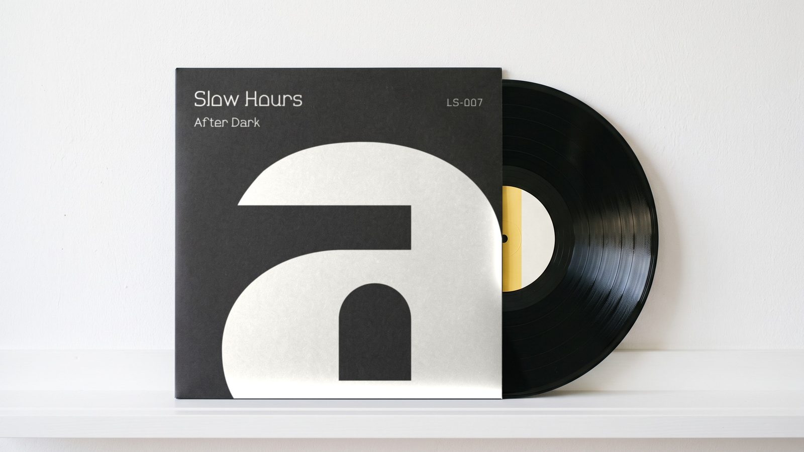
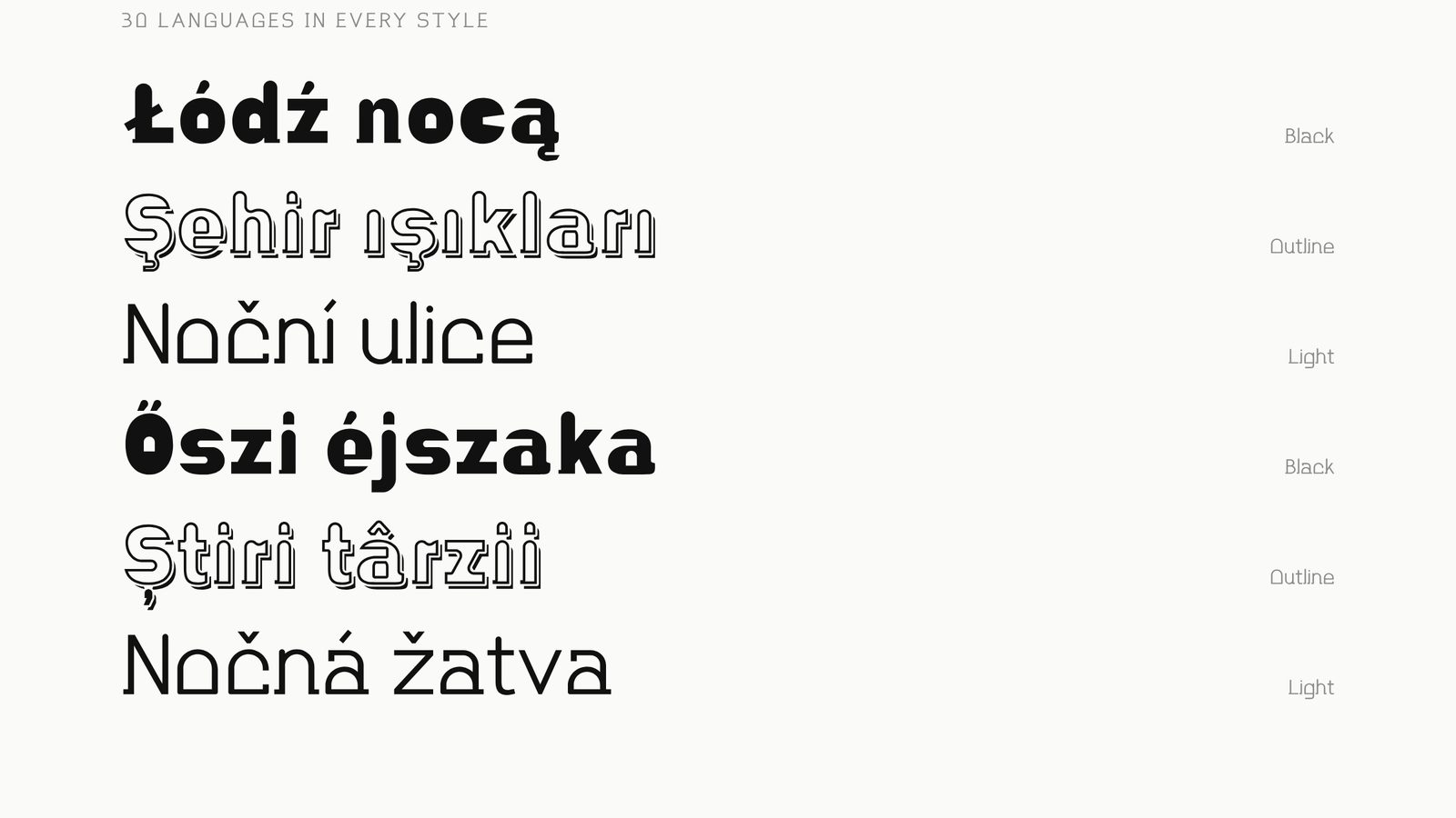
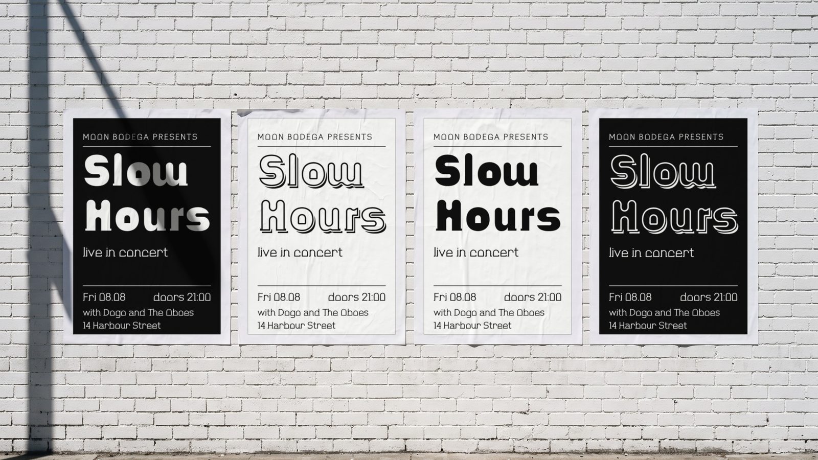
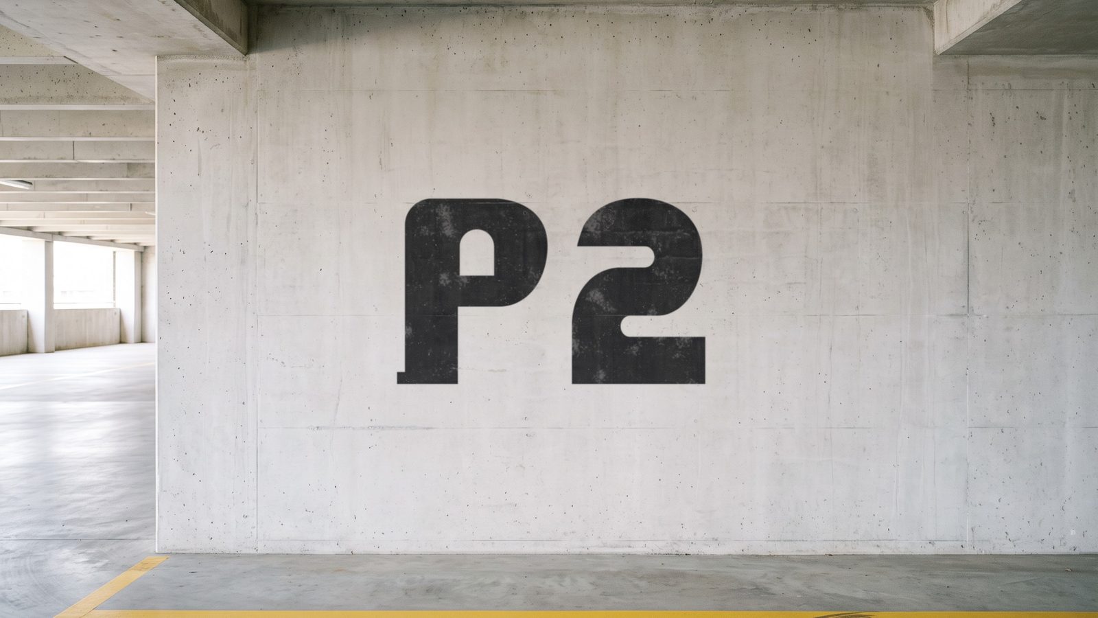
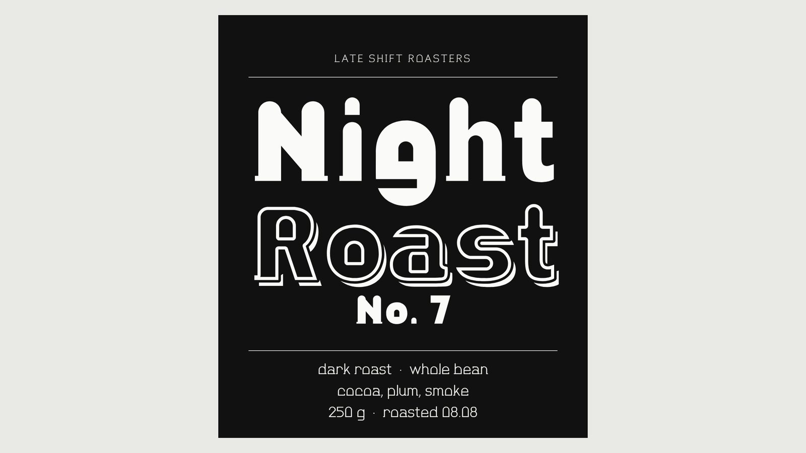
Nottano is a display sans family in three styles: Black, Outline and Light. Its name comes from night: every letter keeps one small arched window, like a quiet house where someone is still awake. Black is the heavy headline, Light the thin voice beside it, Outline the playful one with a soft shadow. Set them together on posters, covers, labels and packaging.
Get Nottano on Gumroad · Also on Etsy · Also on itch.io · Licence
- Styles
- Black, Outline, Light
- Genre
- Display sans
- Languages
- 30, Latin script
- Best at
- 36 px and up
A warm slab serif in three styles, for shop signs.
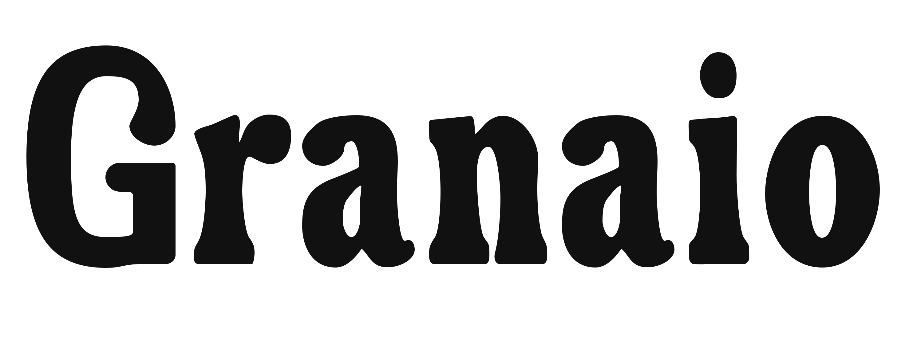
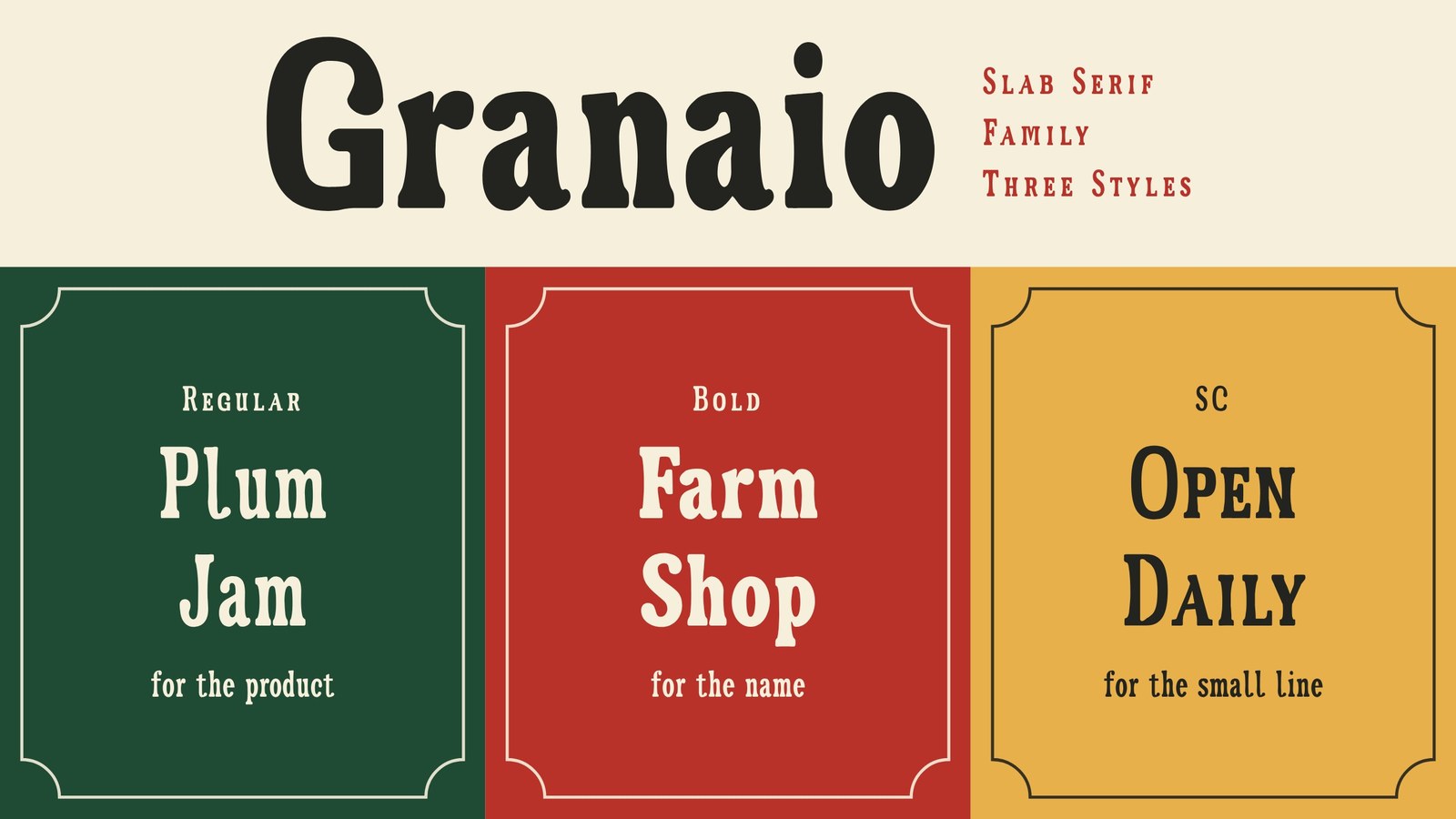
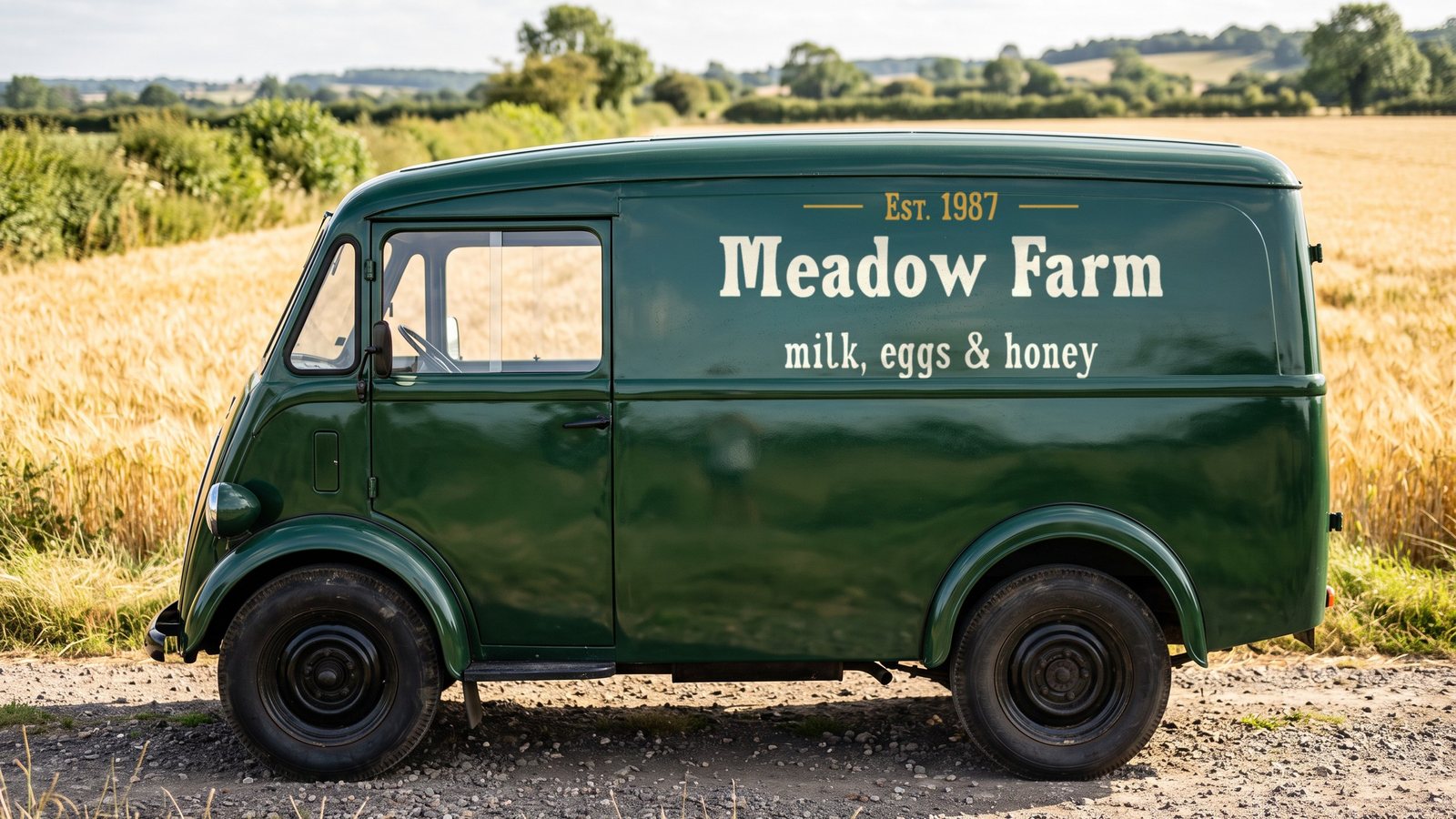
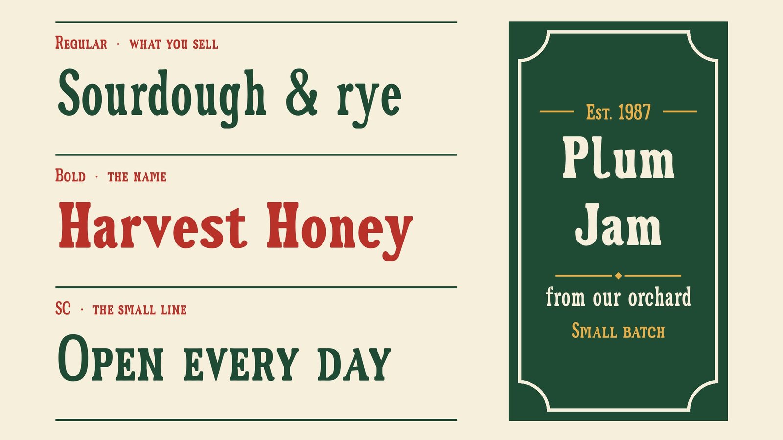
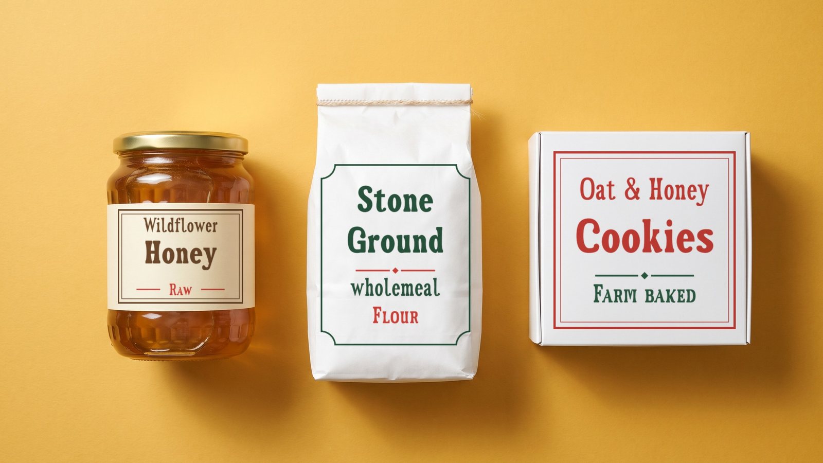
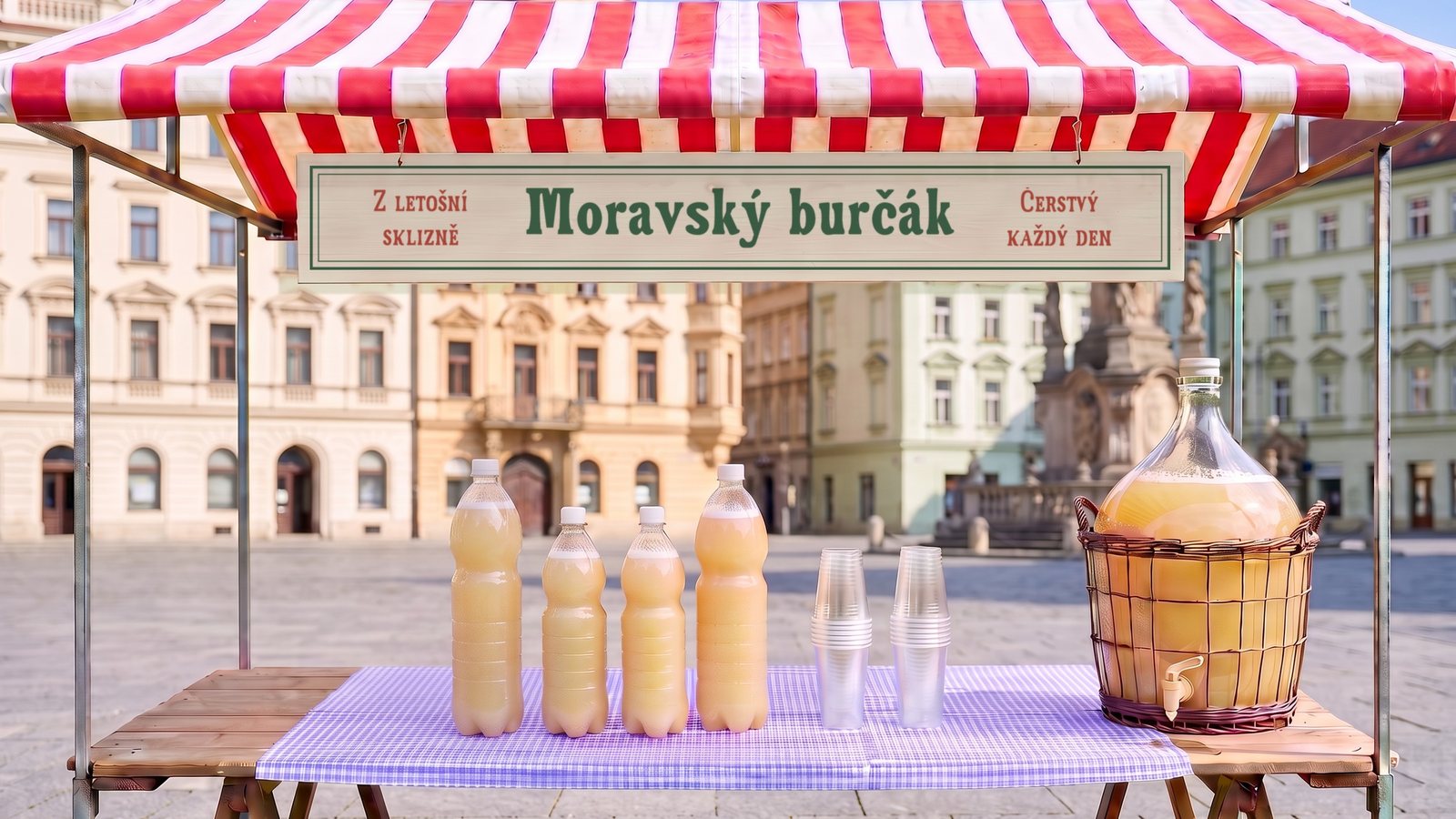
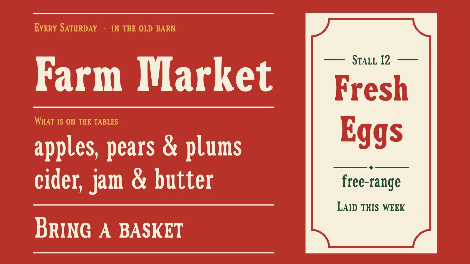
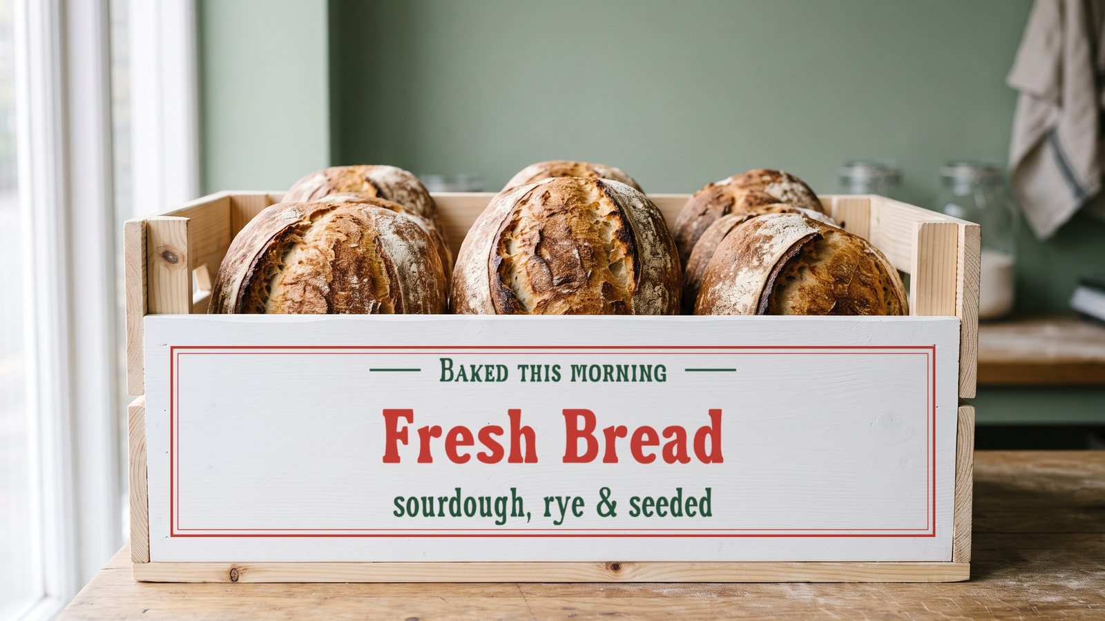
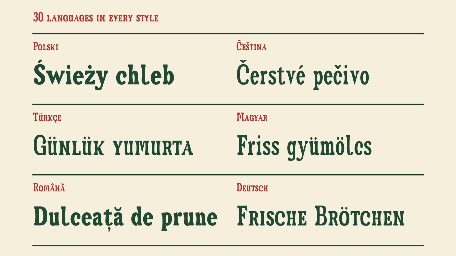
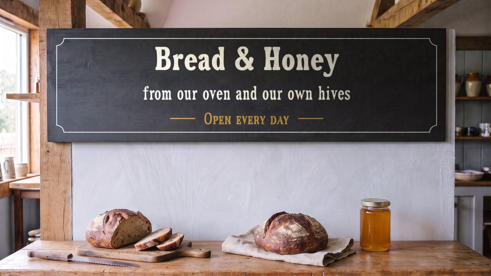
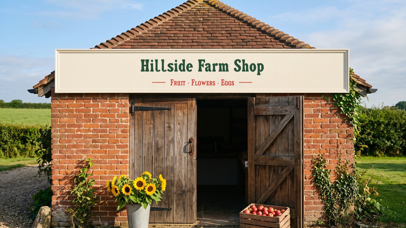
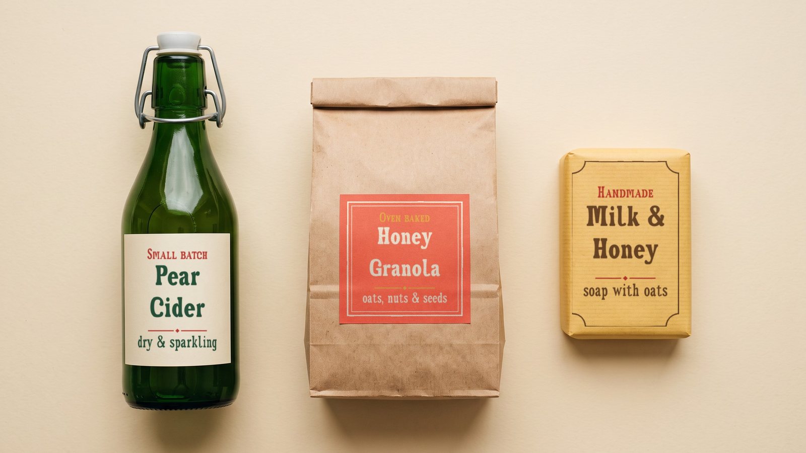
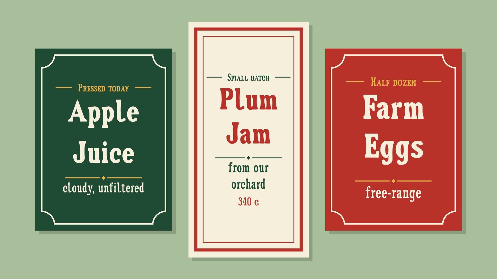
Granaio is a warm slab serif display family in three styles: Regular, Bold and SC, the small caps. Its name means the granary where a farm keeps its harvest, and its letters come from the names painted on farm-shop boards and delivery vans: heavy, friendly and a little narrow, with the soft touch of a sign-painter's brush. Set it on shop signs, labels, packaging and price cards.
Get Granaio on Gumroad · Also on Etsy · Also on itch.io · Licence
- Styles
- Regular, Bold, SC
- Genre
- Slab serif
- Languages
- 30, Latin script
- Best at
- 24 px and up
A flared sans in four styles, for labels.
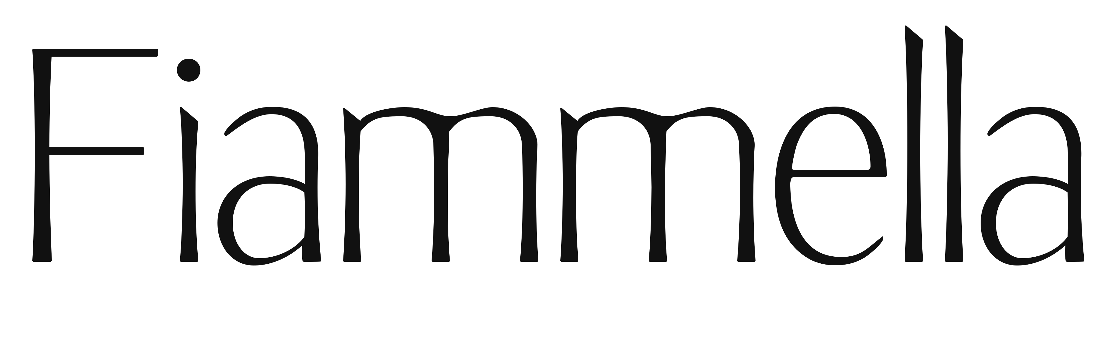
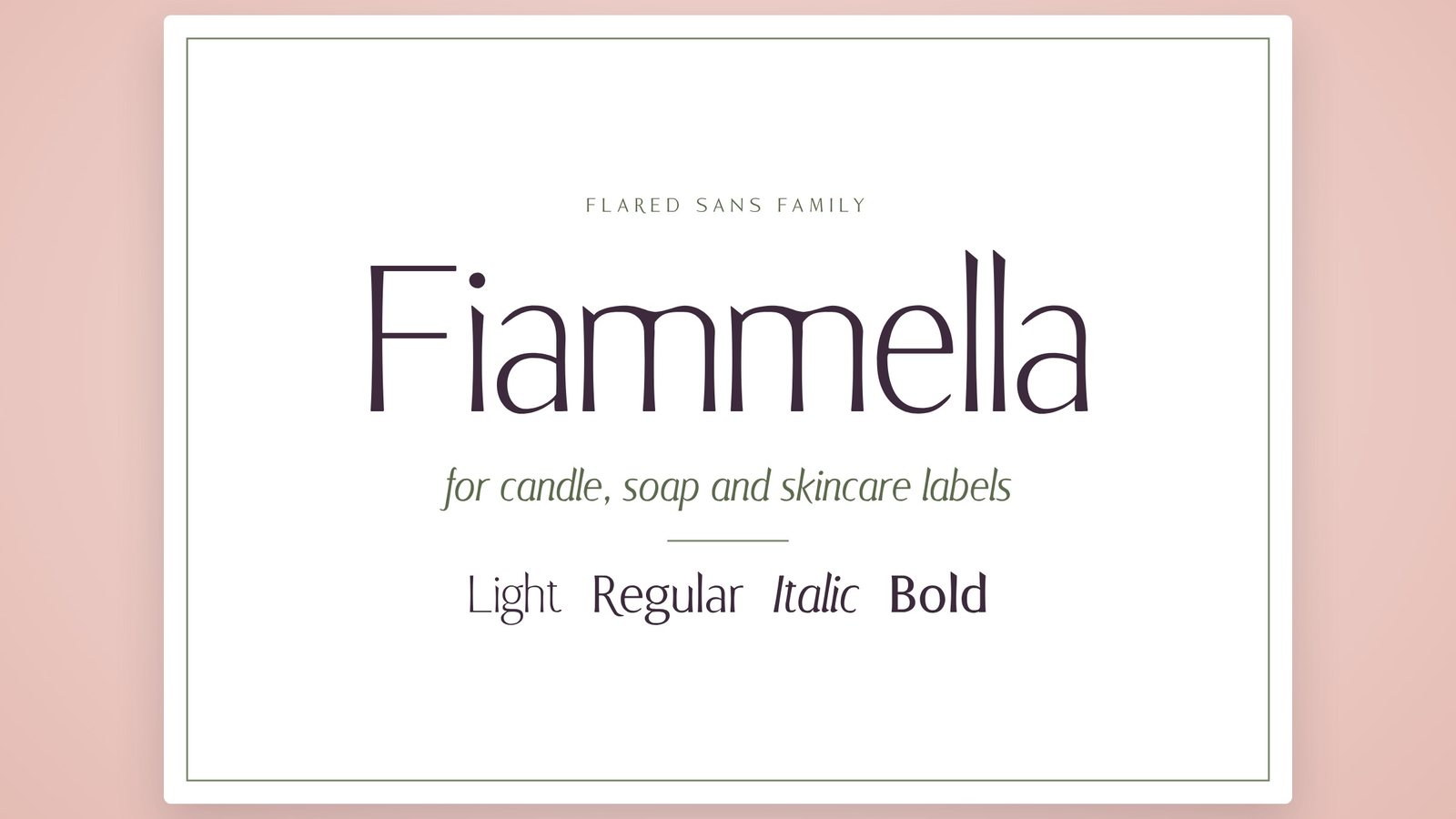
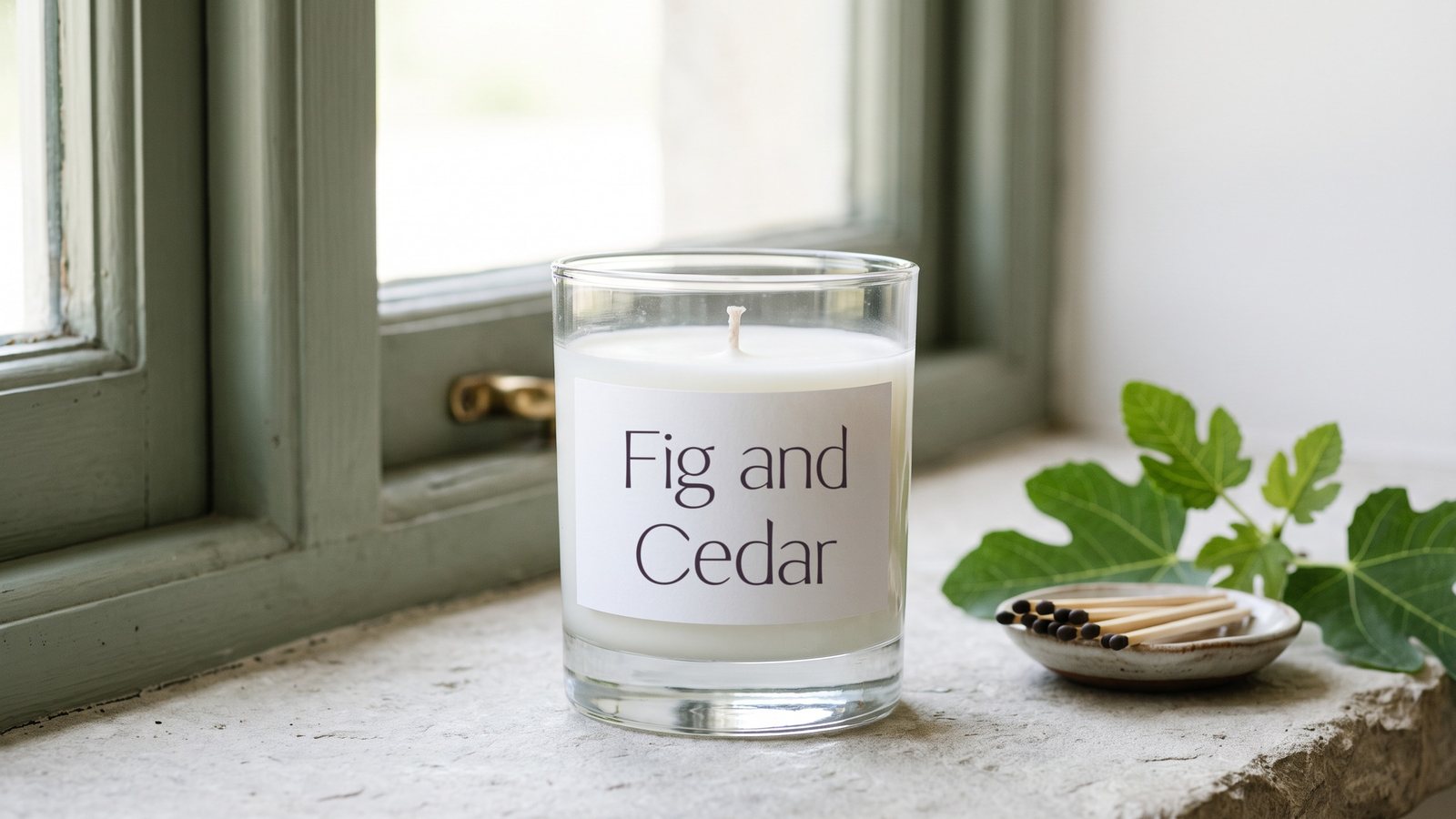
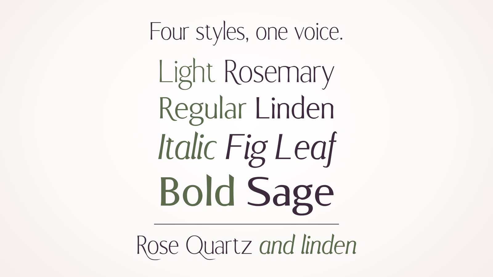
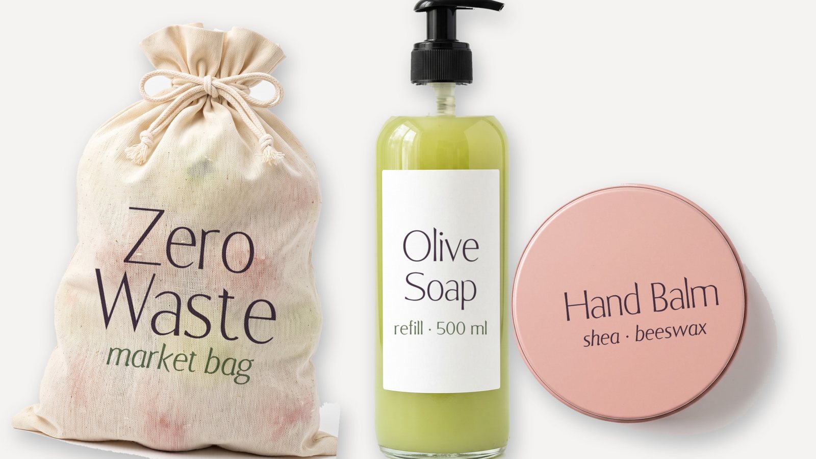
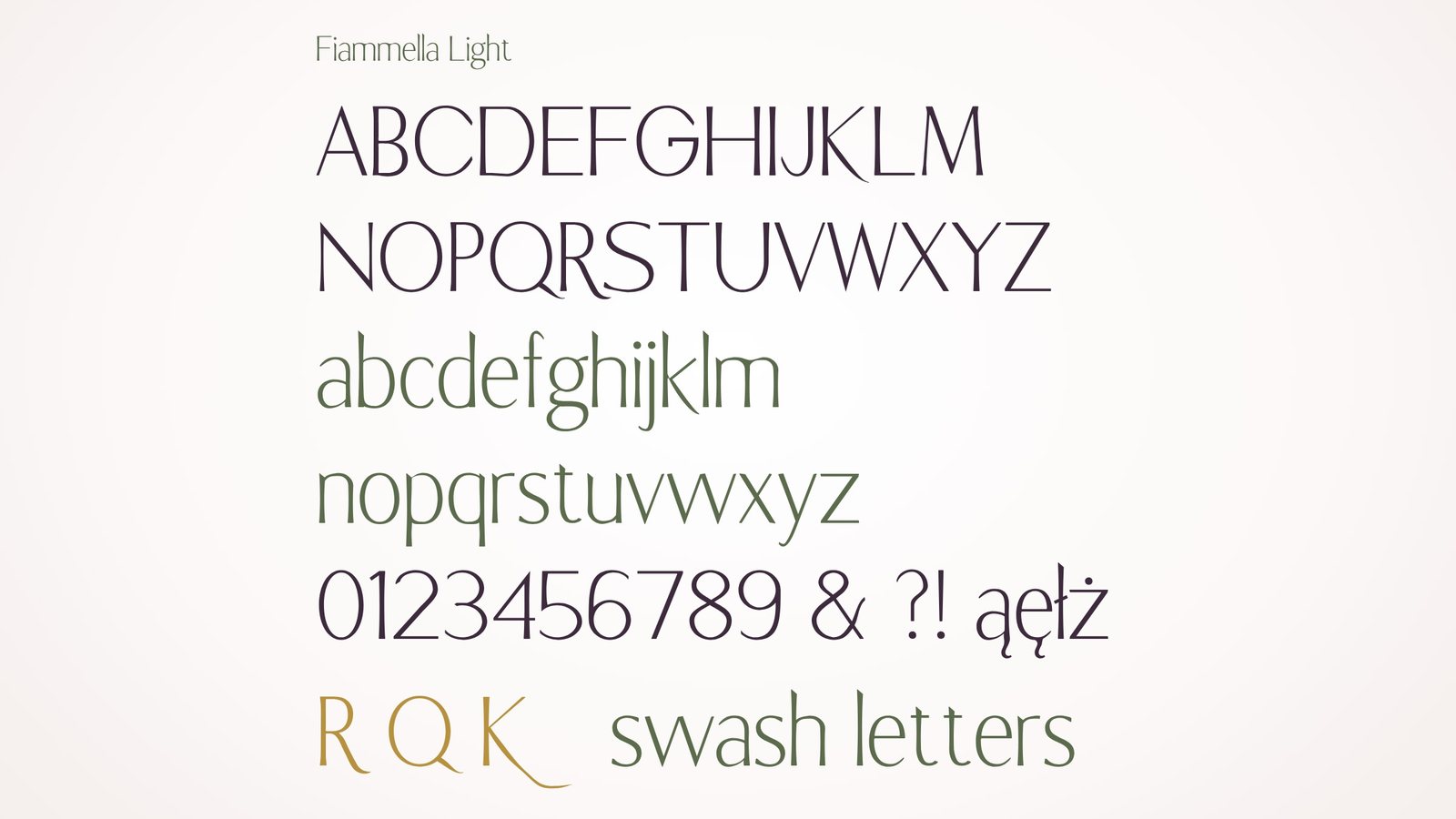
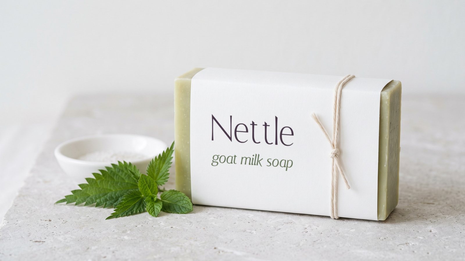
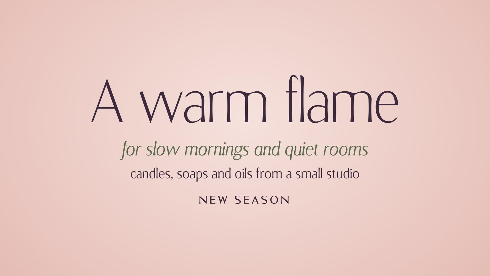
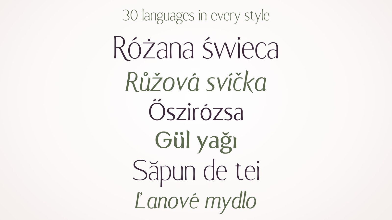
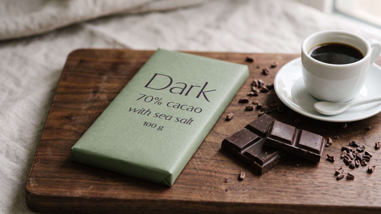
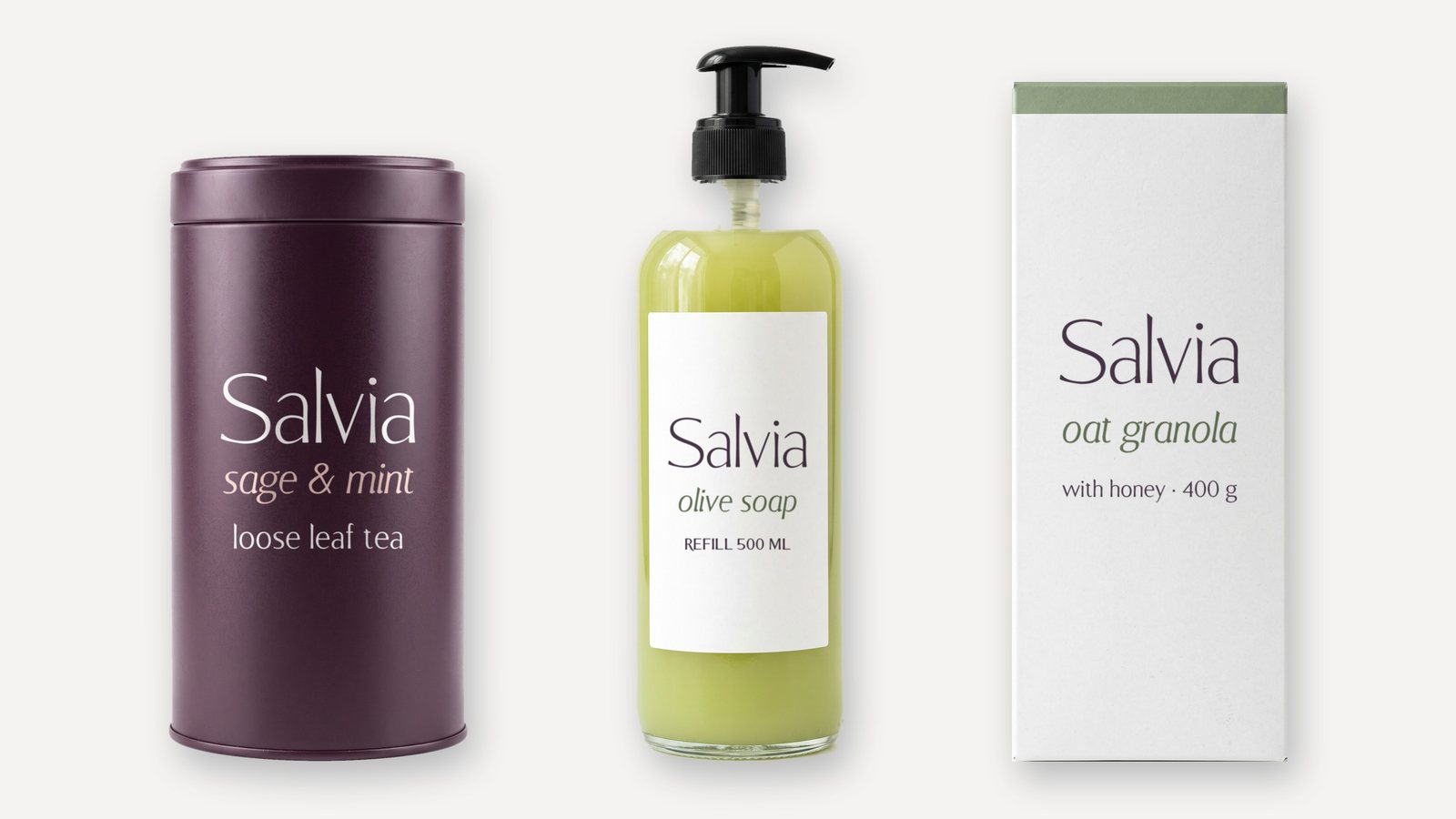
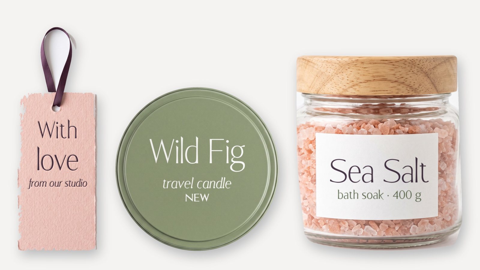
Fiammella is a flared sans serif family in four styles: Light, Regular, Italic and Bold. Its name means little flame, and its strokes swell gently toward their ends like the tip of a candle flame, with long swash tails for names. Calm, warm and quietly premium, it suits labels and packaging for candles, soap and natural cosmetics.
Get Fiammella on Gumroad · Also on Etsy · Also on itch.io · Licence
- Styles
- Light, Regular, Italic, Bold
- Genre
- Flared sans
- Languages
- 30, Latin script
- Best at
- 24 px and up

05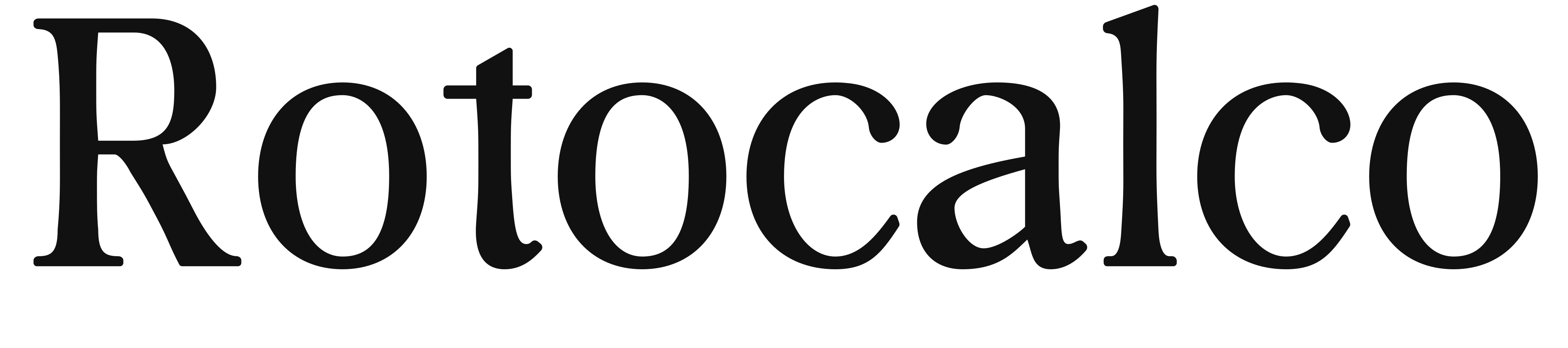
Available on MyFontsAvailable on FontspringAvailable on GumroadAvailable on EtsyAvailable on itch.io
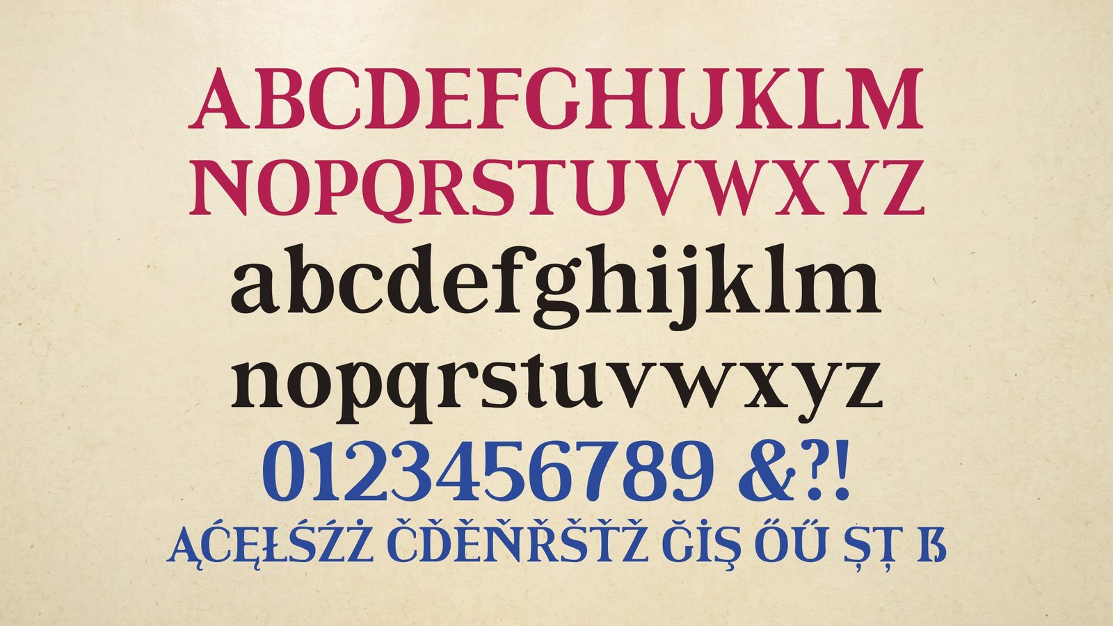
A retro editorial serif in four styles.
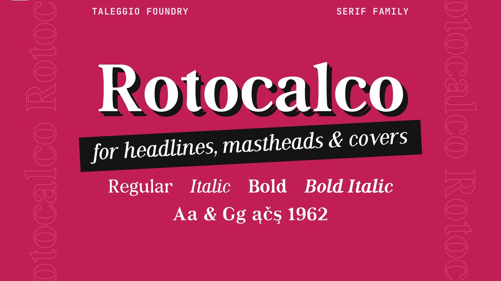
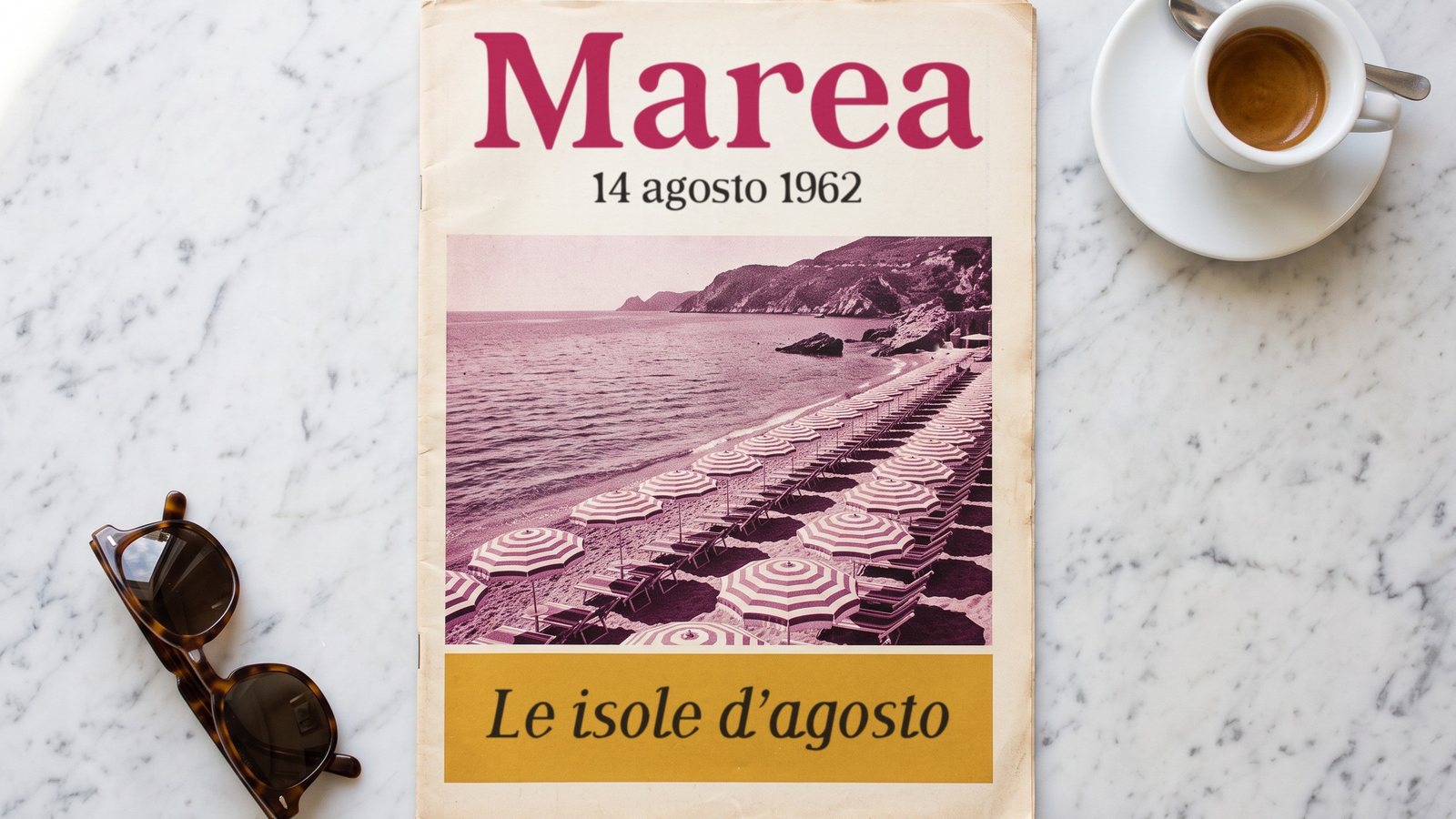
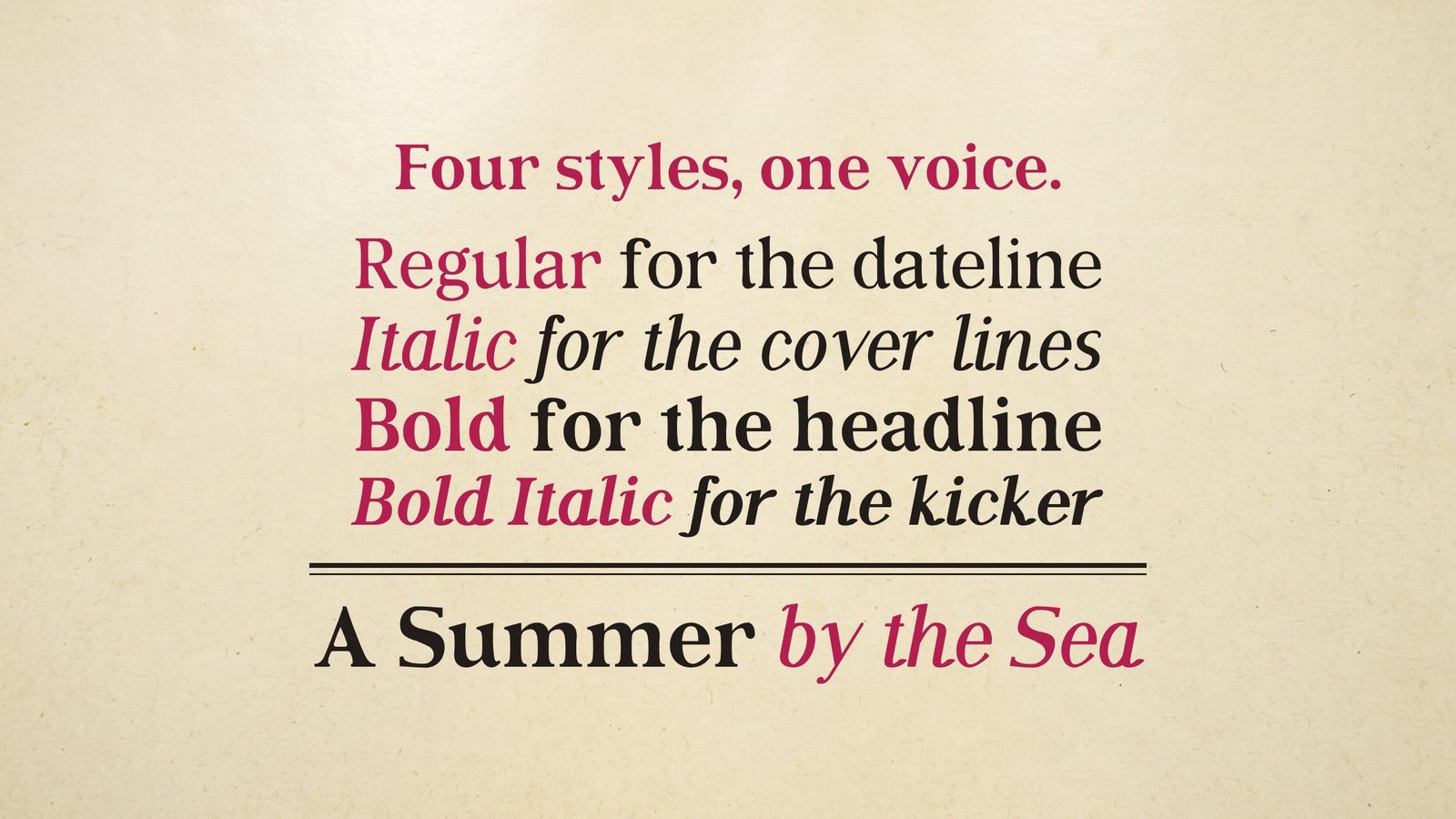
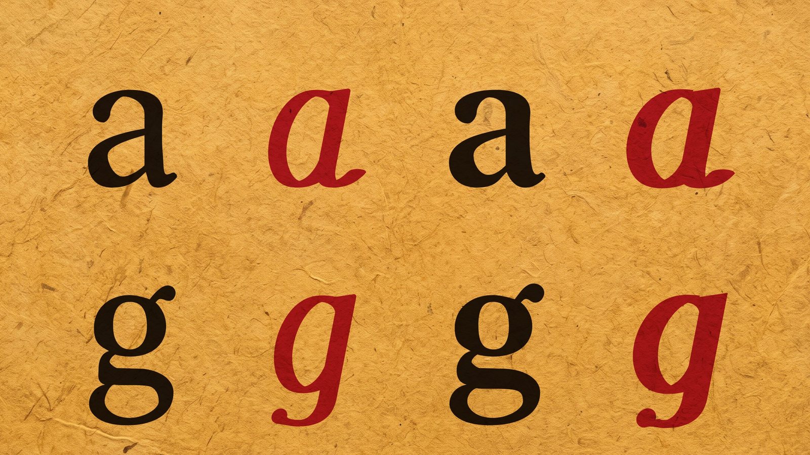
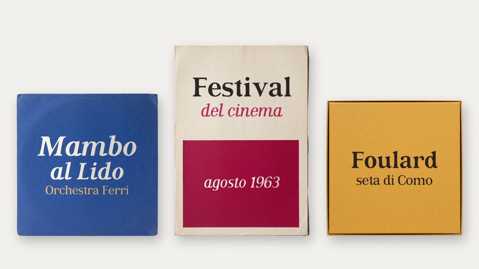
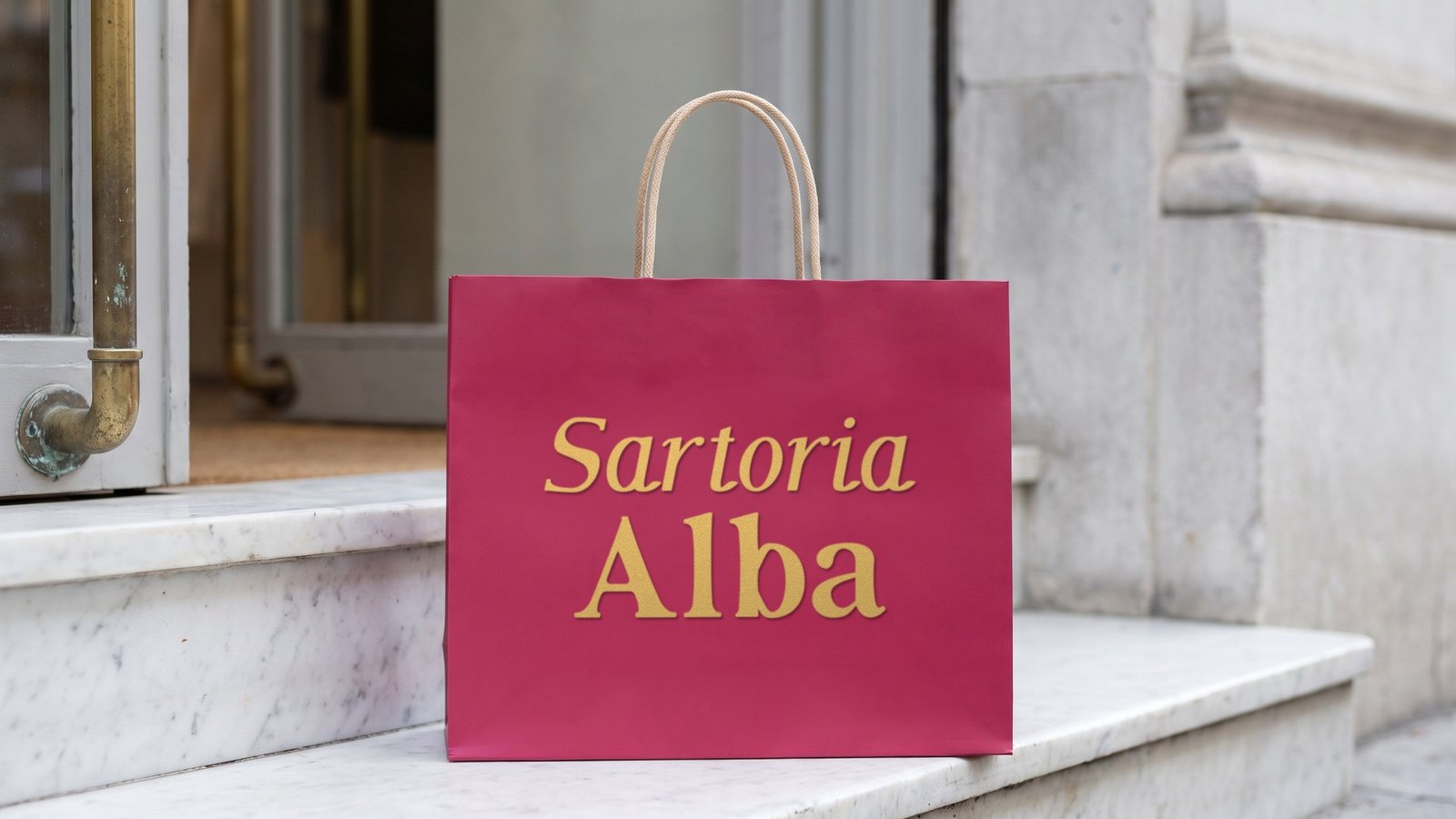
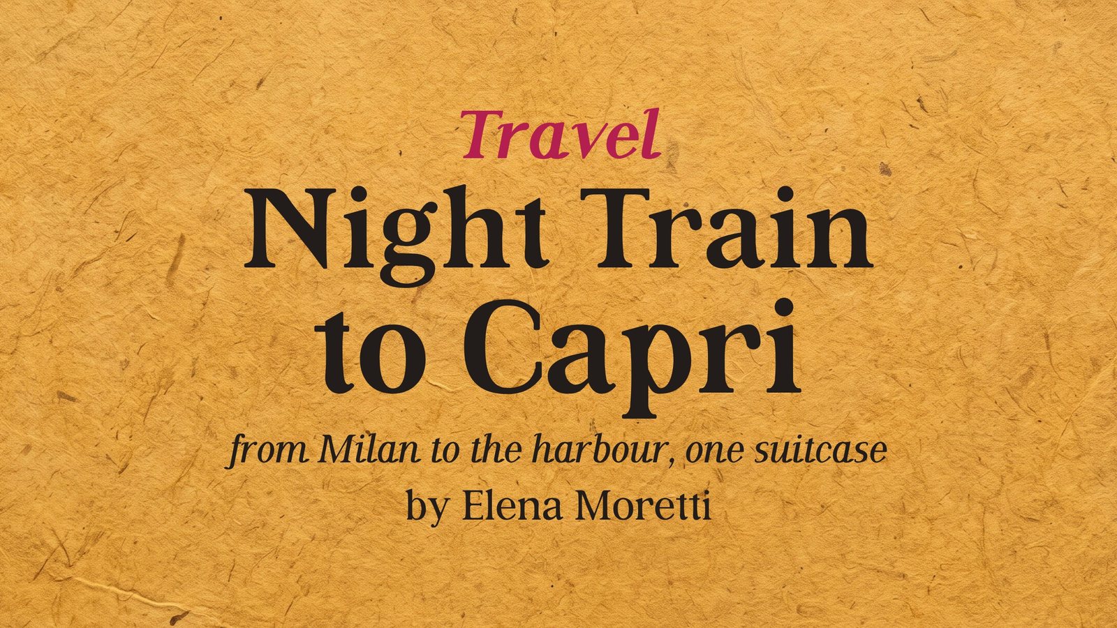
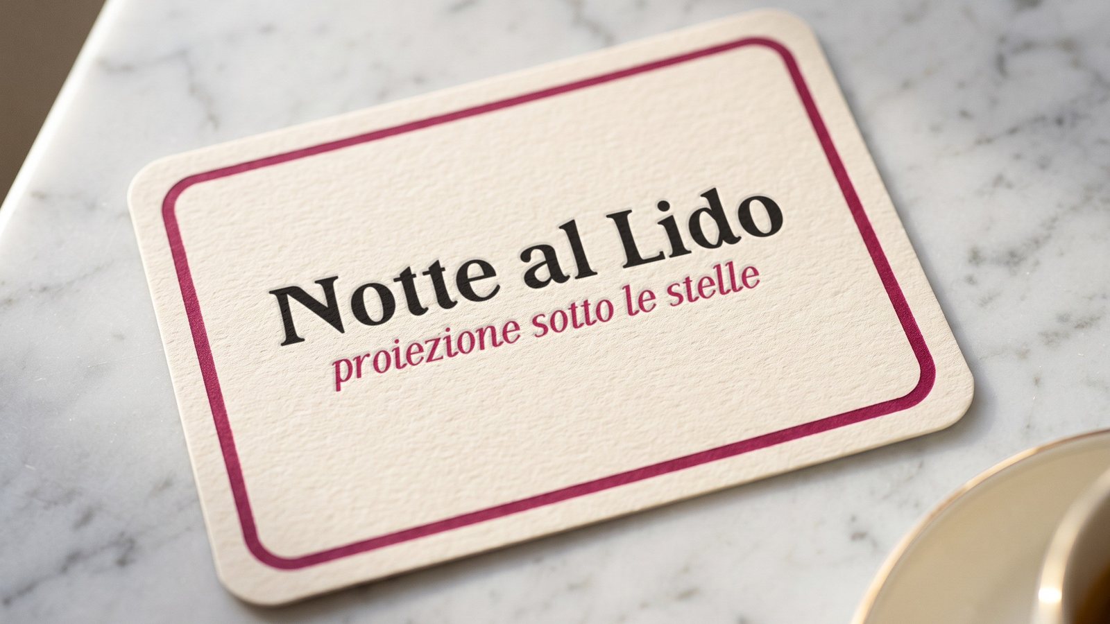
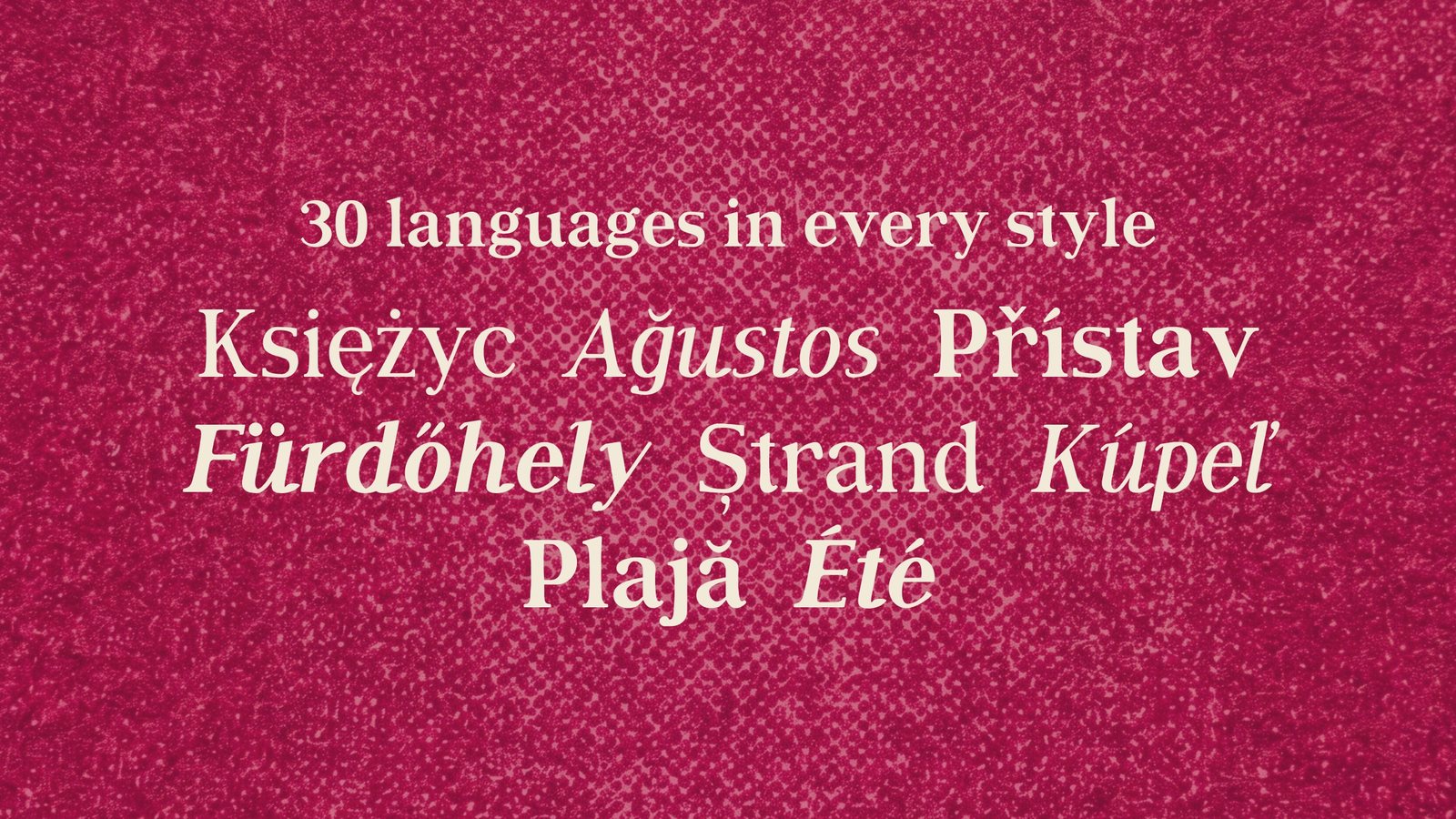
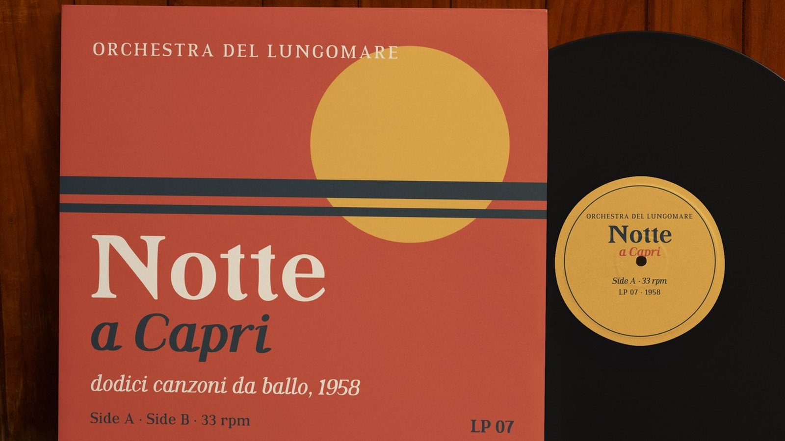
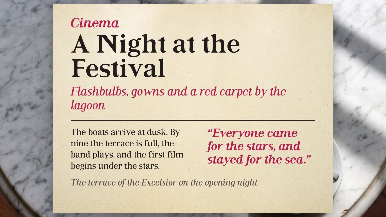
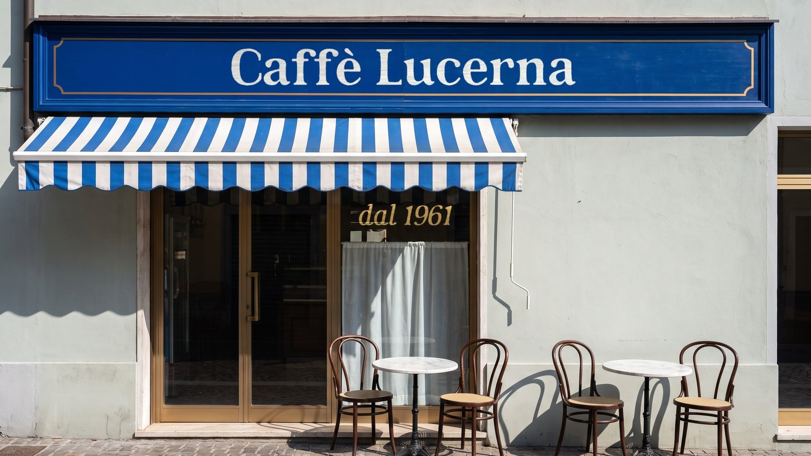
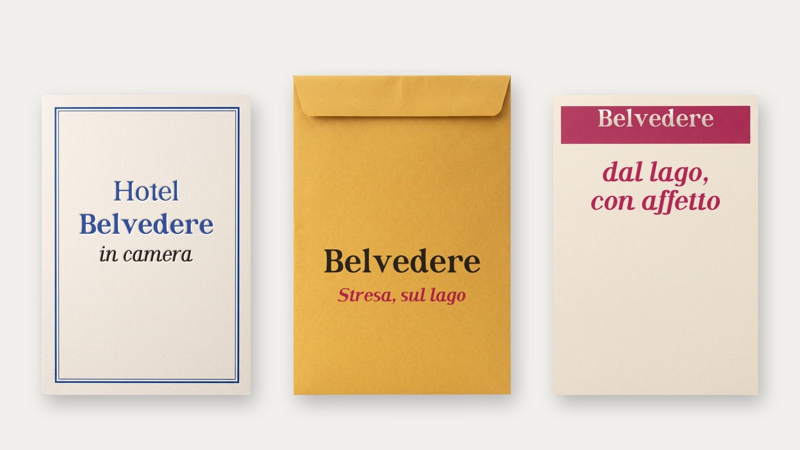
Rotocalco is a retro editorial serif family in four styles: Regular, Italic, Bold and Bold Italic. It is named after the Italian illustrated weeklies printed by rotogravure, and its round, full letters bring back the confident, friendly glamour of magazine covers and posters from the 1950s to the 1970s. Set it large on headlines, book covers, posters and packaging.
Get Rotocalco on MyFonts · Also on Fontspring · Also on Gumroad · Also on Etsy · Also on itch.io · Licence
- Styles
- Regular, Italic, Bold, Bold Italic
- Genre
- Editorial serif
- Languages
- 30, Latin script
- Best at
- 24 px and up
04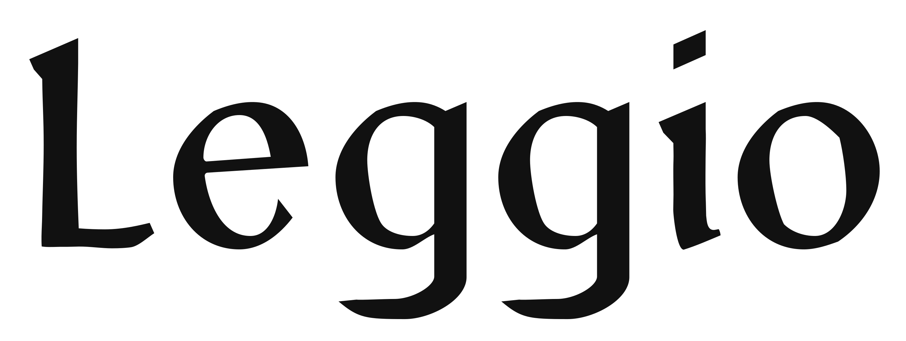
Available on MyFontsAvailable on FontspringAvailable on GumroadAvailable on EtsyAvailable on itch.io
A medieval hand that still reads.
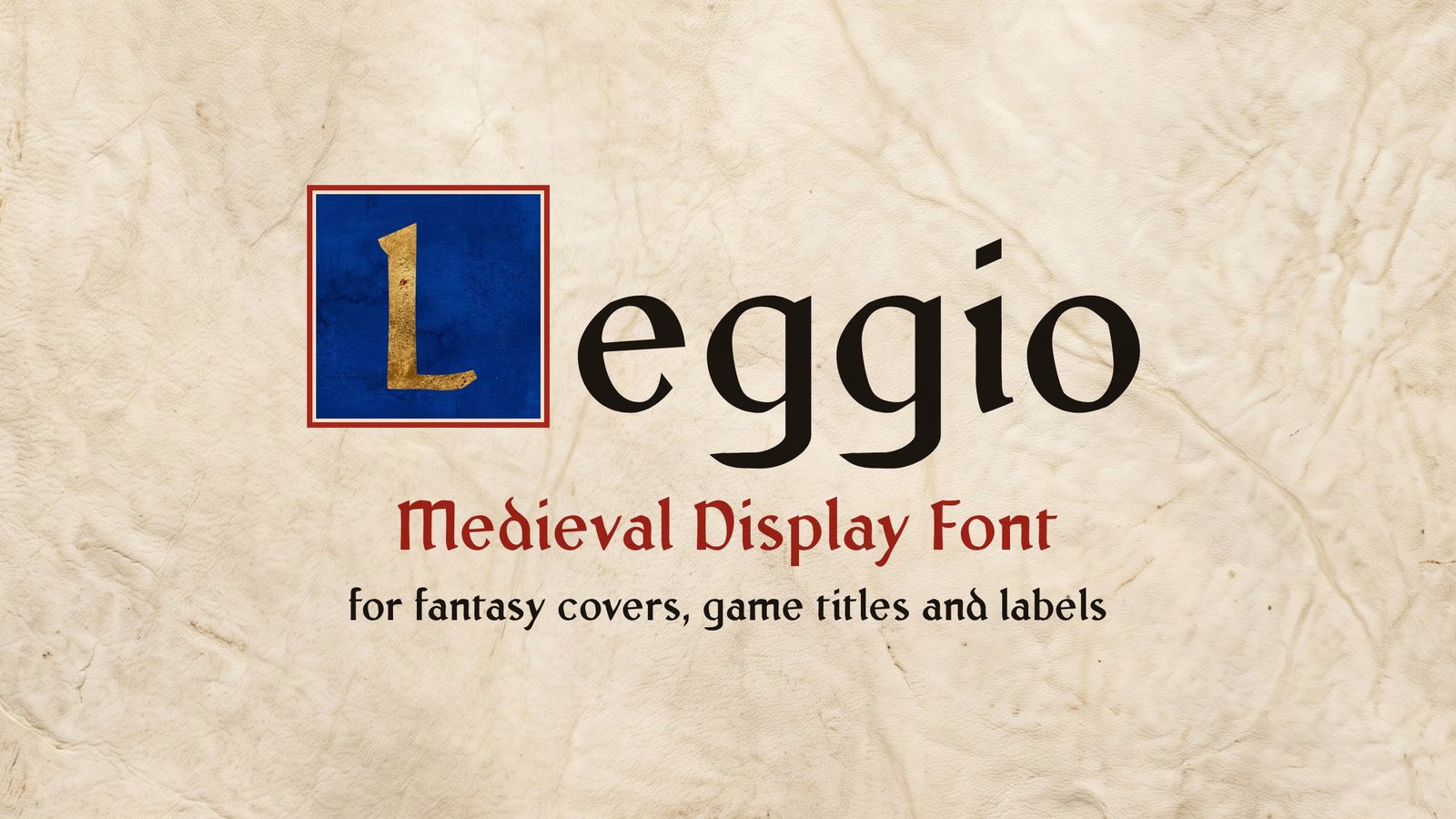
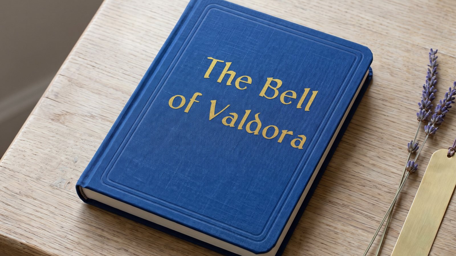
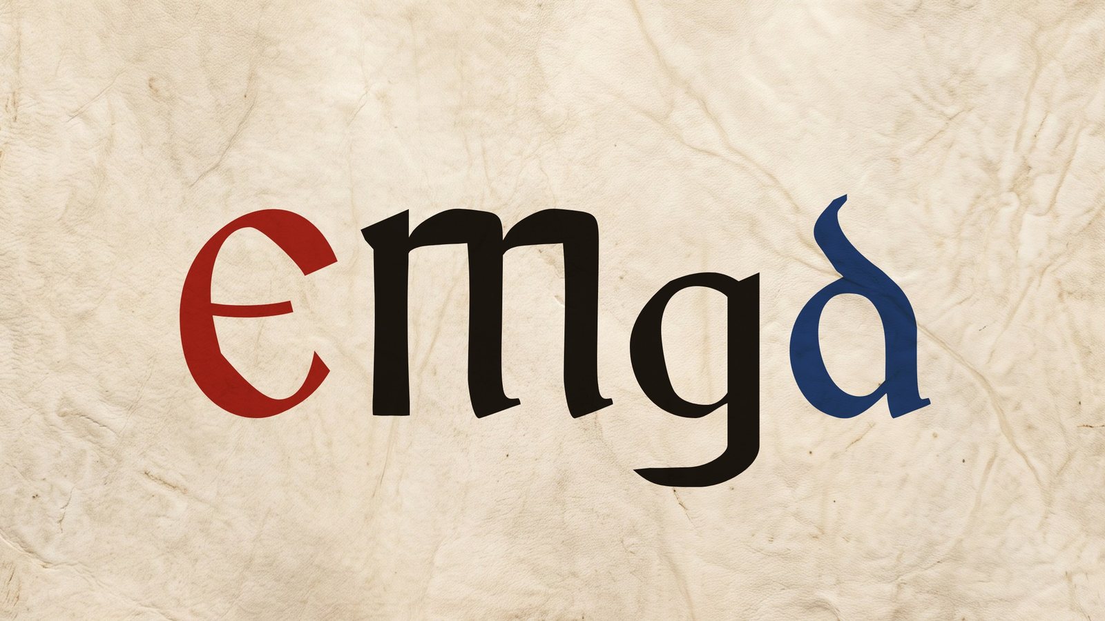
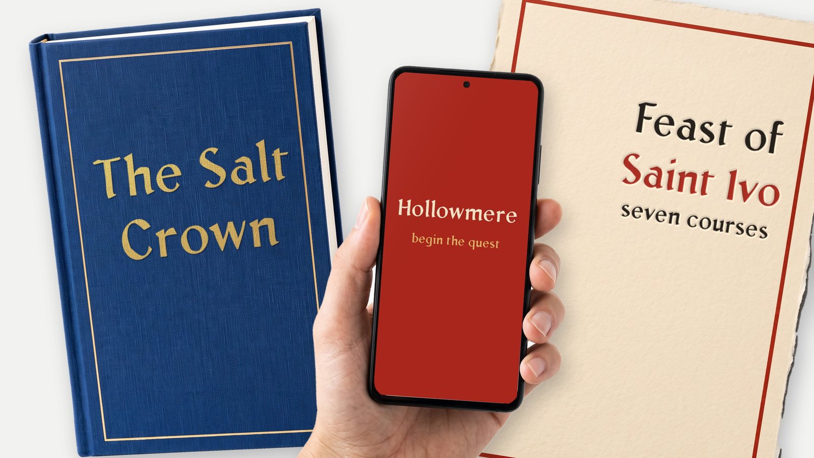
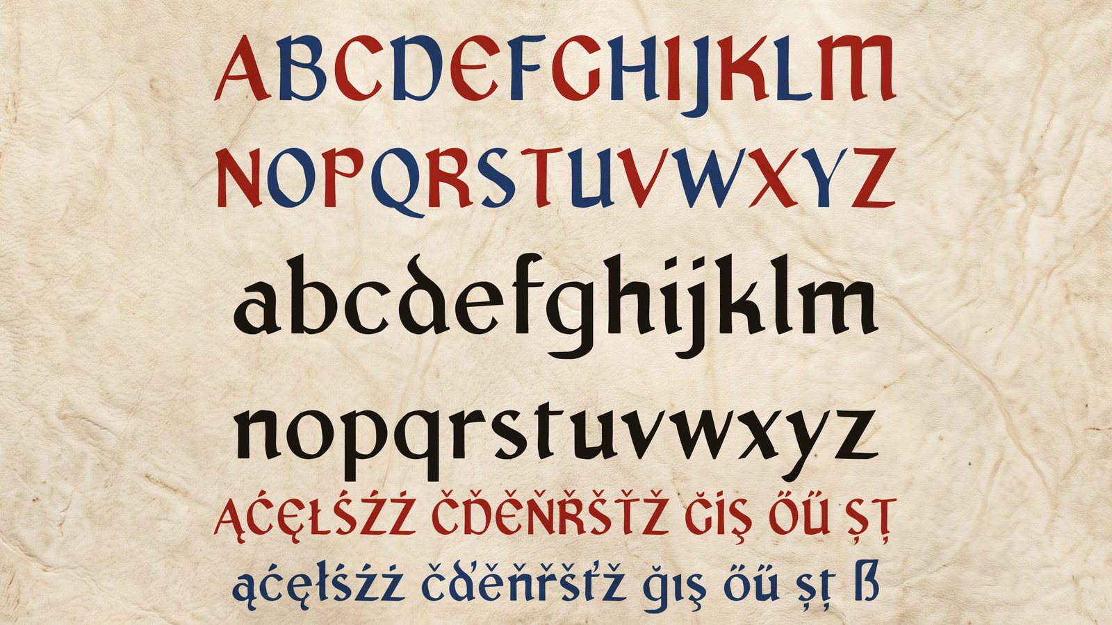
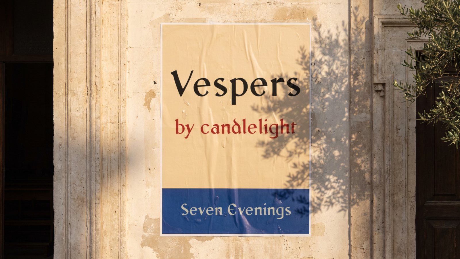
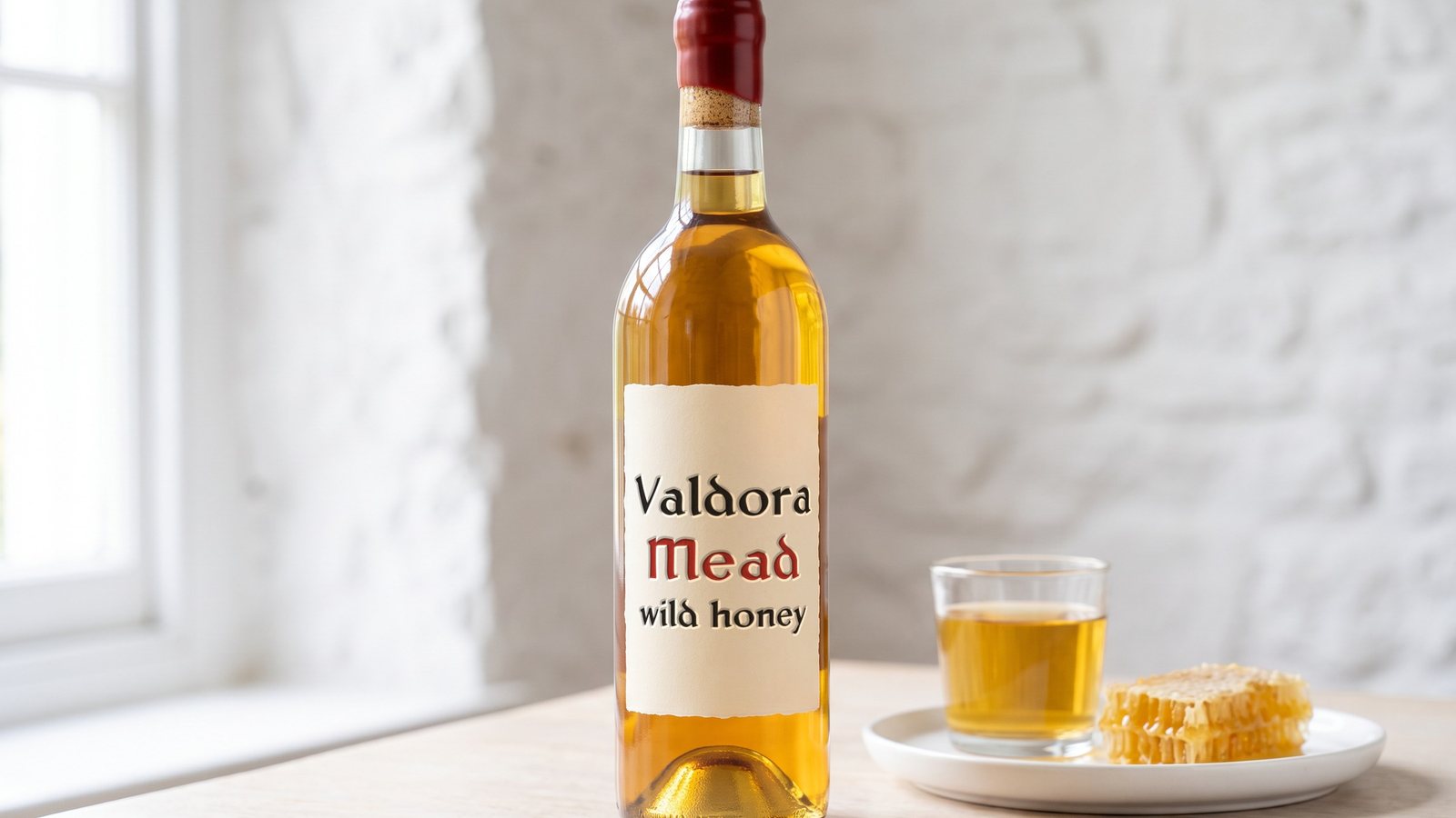
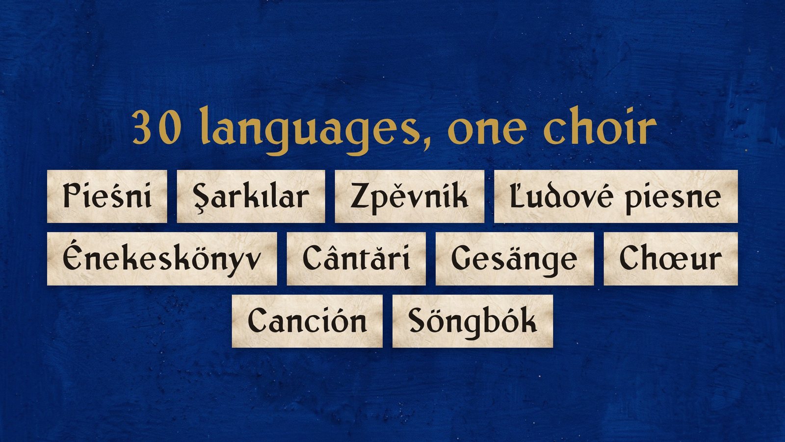
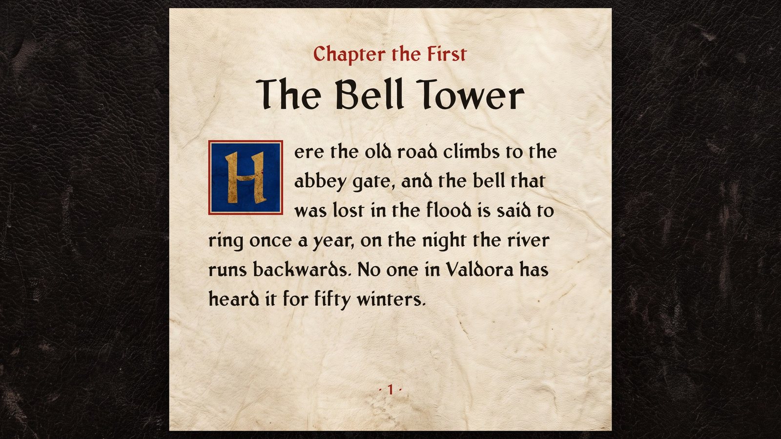
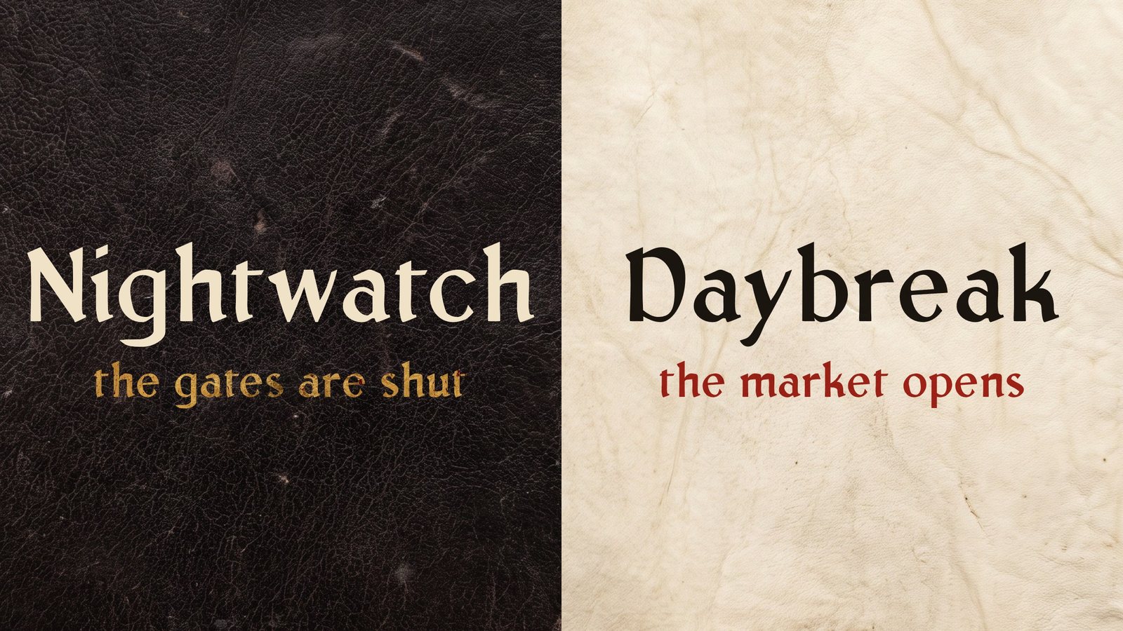
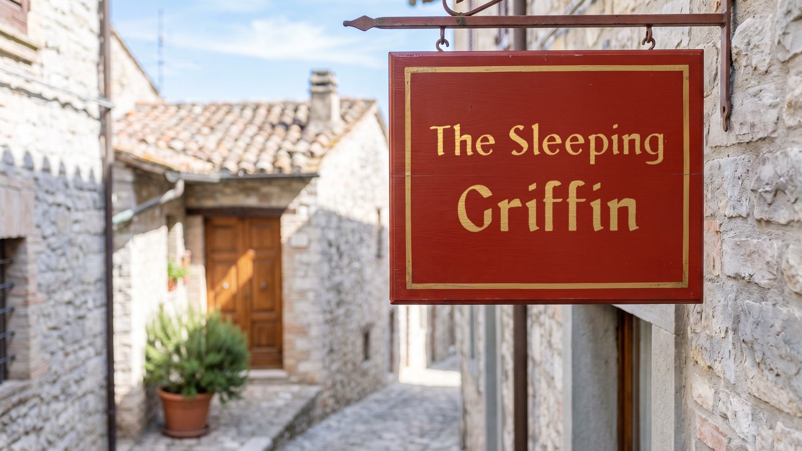
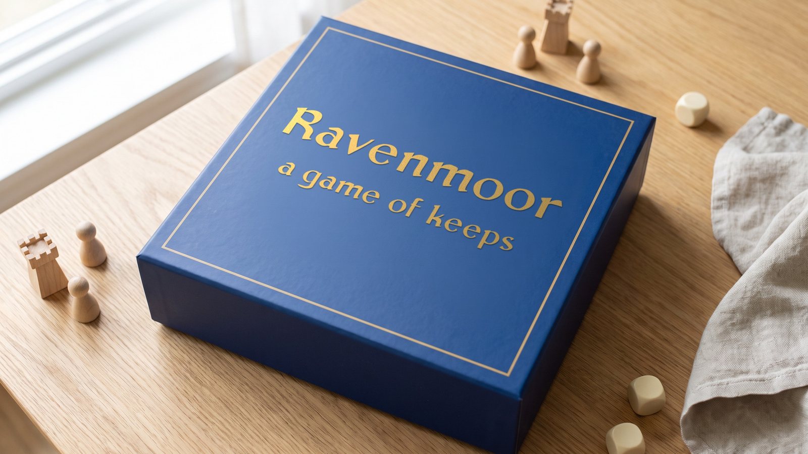
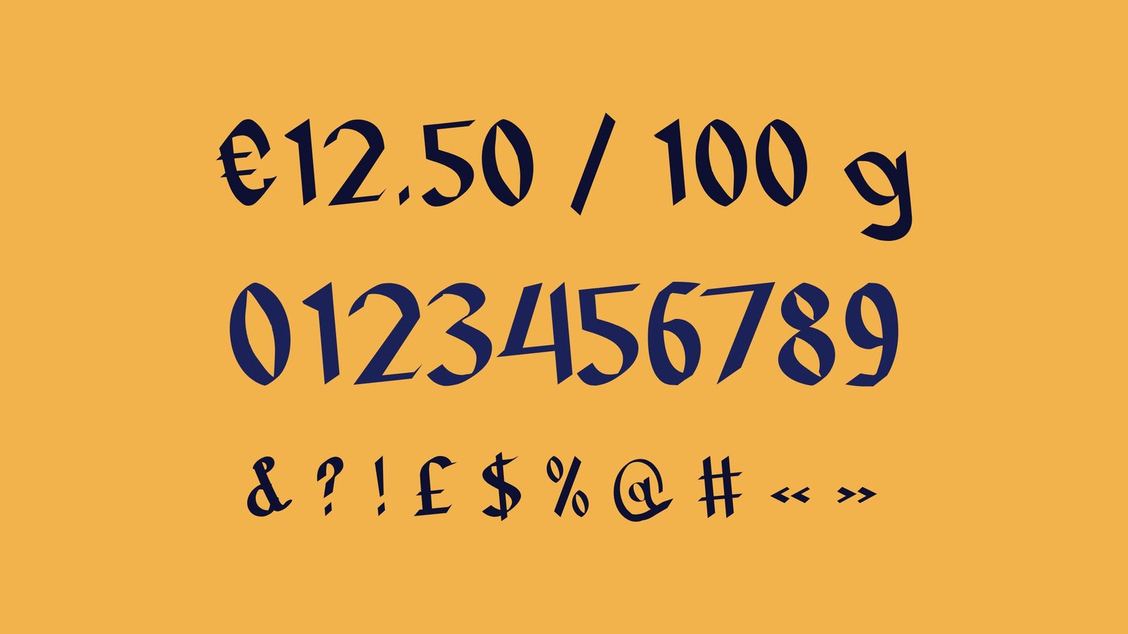
Leggio is a medieval display font. Its name is Italian for the lectern that held the great choir books, and its letters are inspired by the Rotunda book hands of 14th- and 15th-century Italy. Sharp pen strokes and open, generous shapes give titles a striking medieval rhythm while smaller text stays easy to read. Set it on fantasy book covers, game titles, labels and posters.
Get Leggio on MyFonts · Also on Fontspring · Also on Gumroad · Also on Etsy · Also on itch.io · Licence
- Style
- Regular
- Genre
- Medieval display
- Languages
- 30, Latin script
- Best at
- 24 px and up
03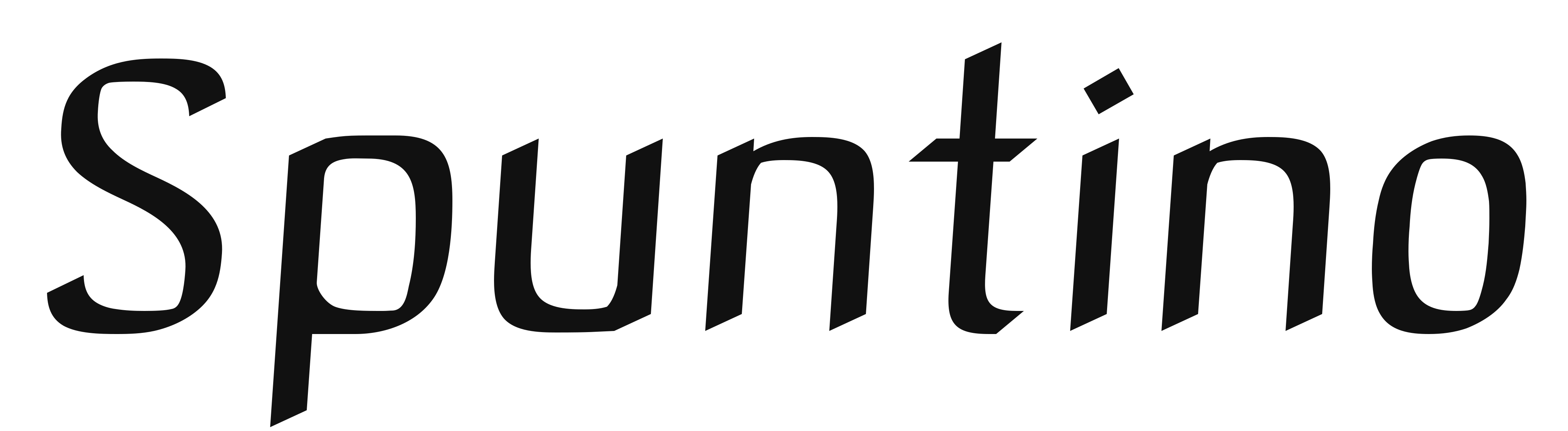
Available on MyFontsAvailable on FontspringAvailable on GumroadAvailable on EtsyAvailable on itch.io
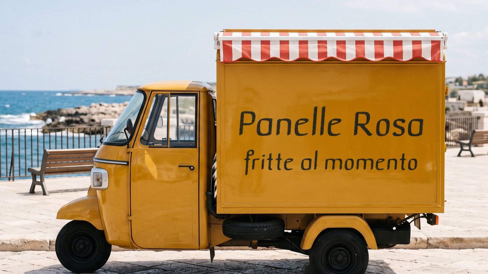
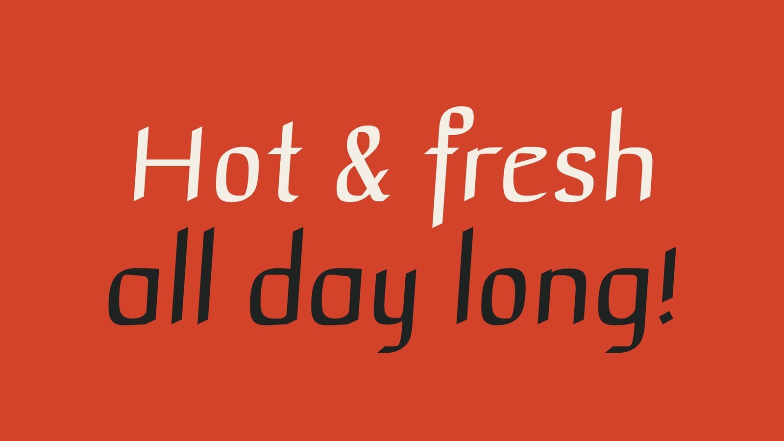
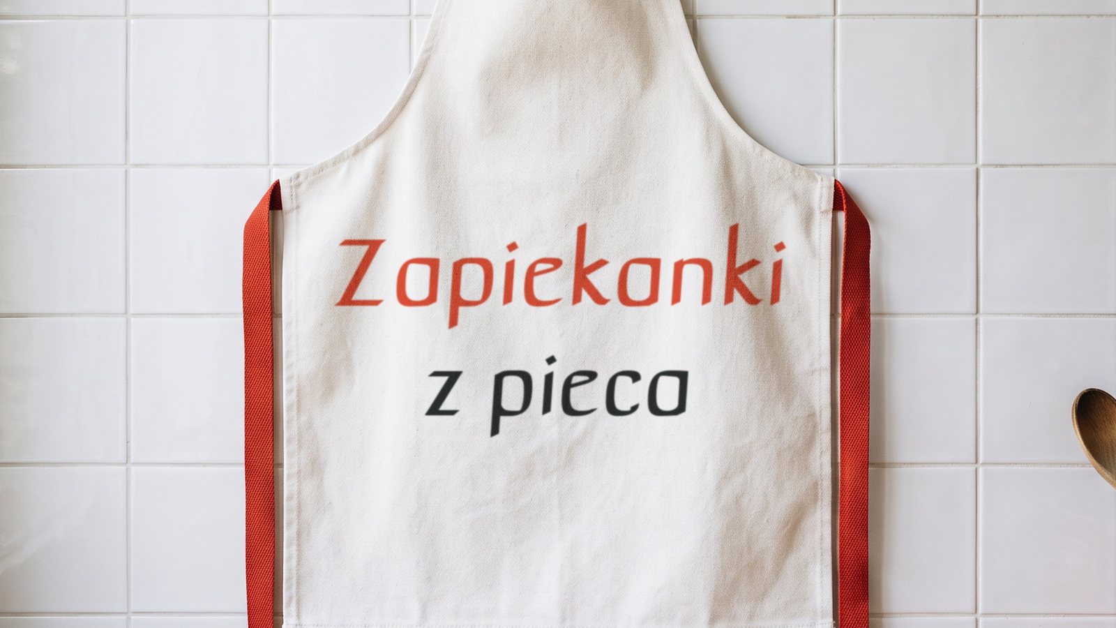
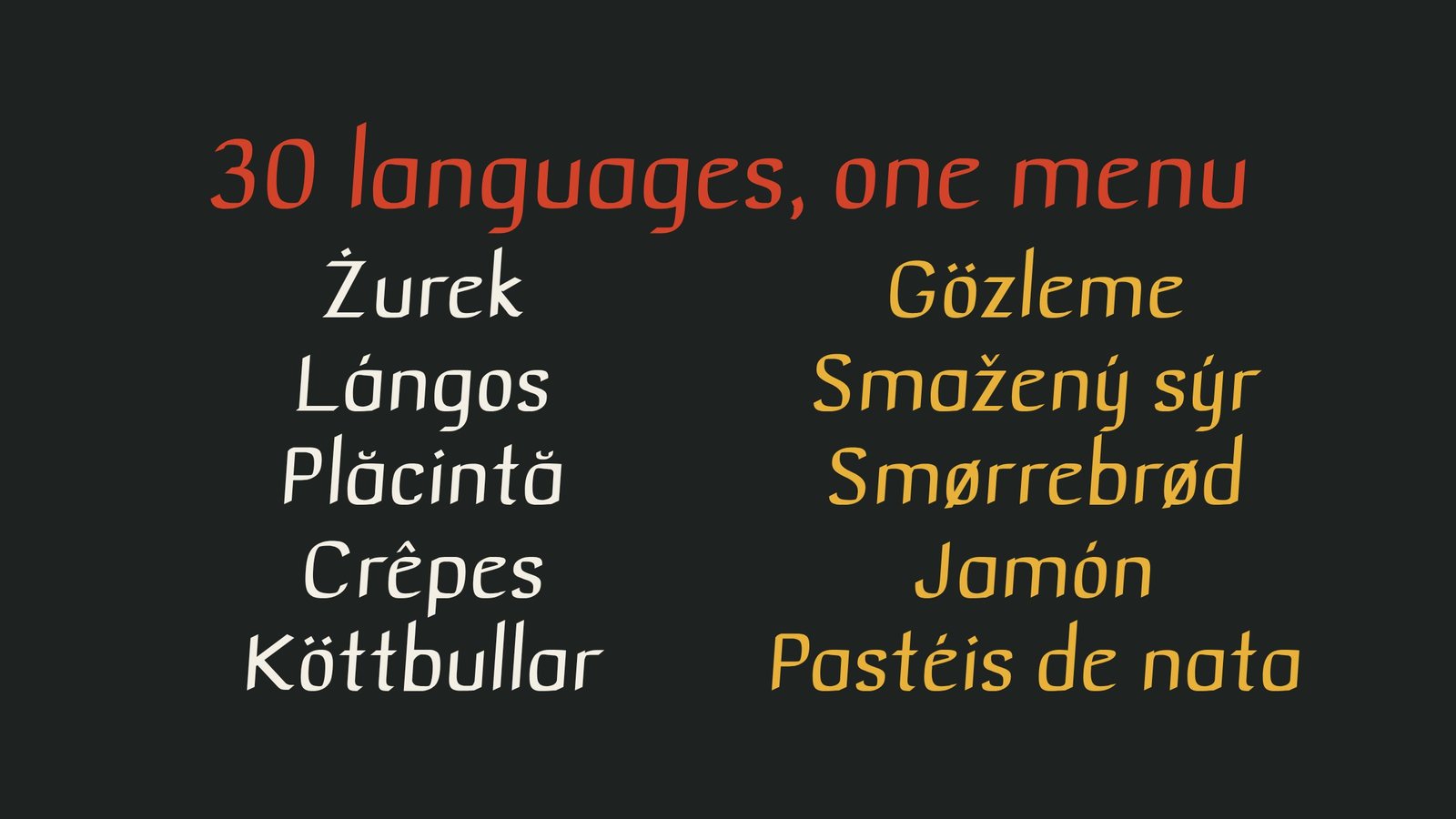
Casual lettering from the menu board.
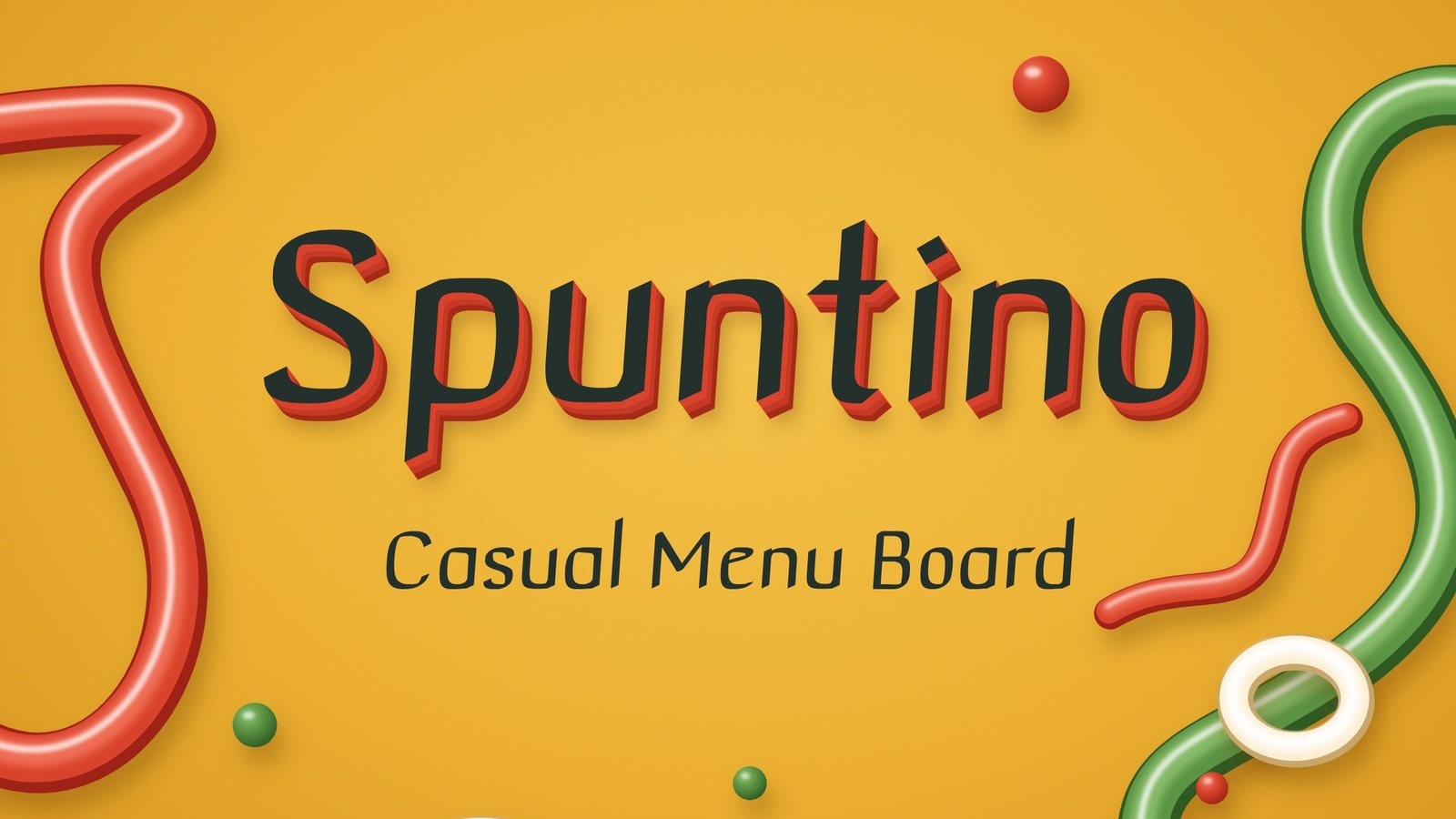
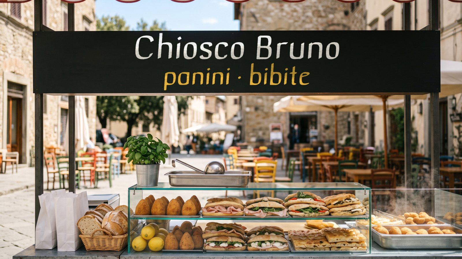
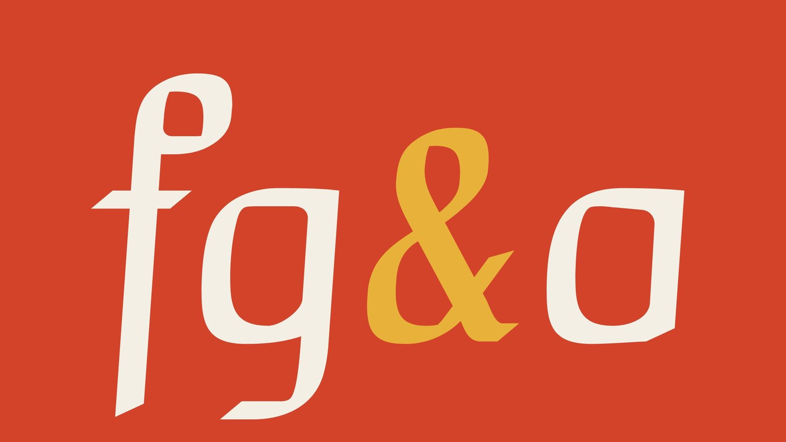
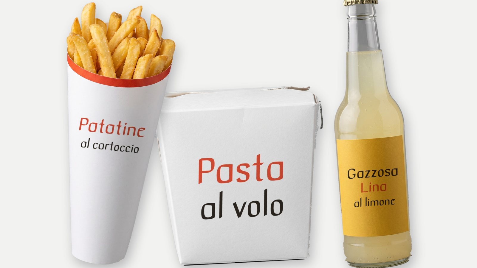
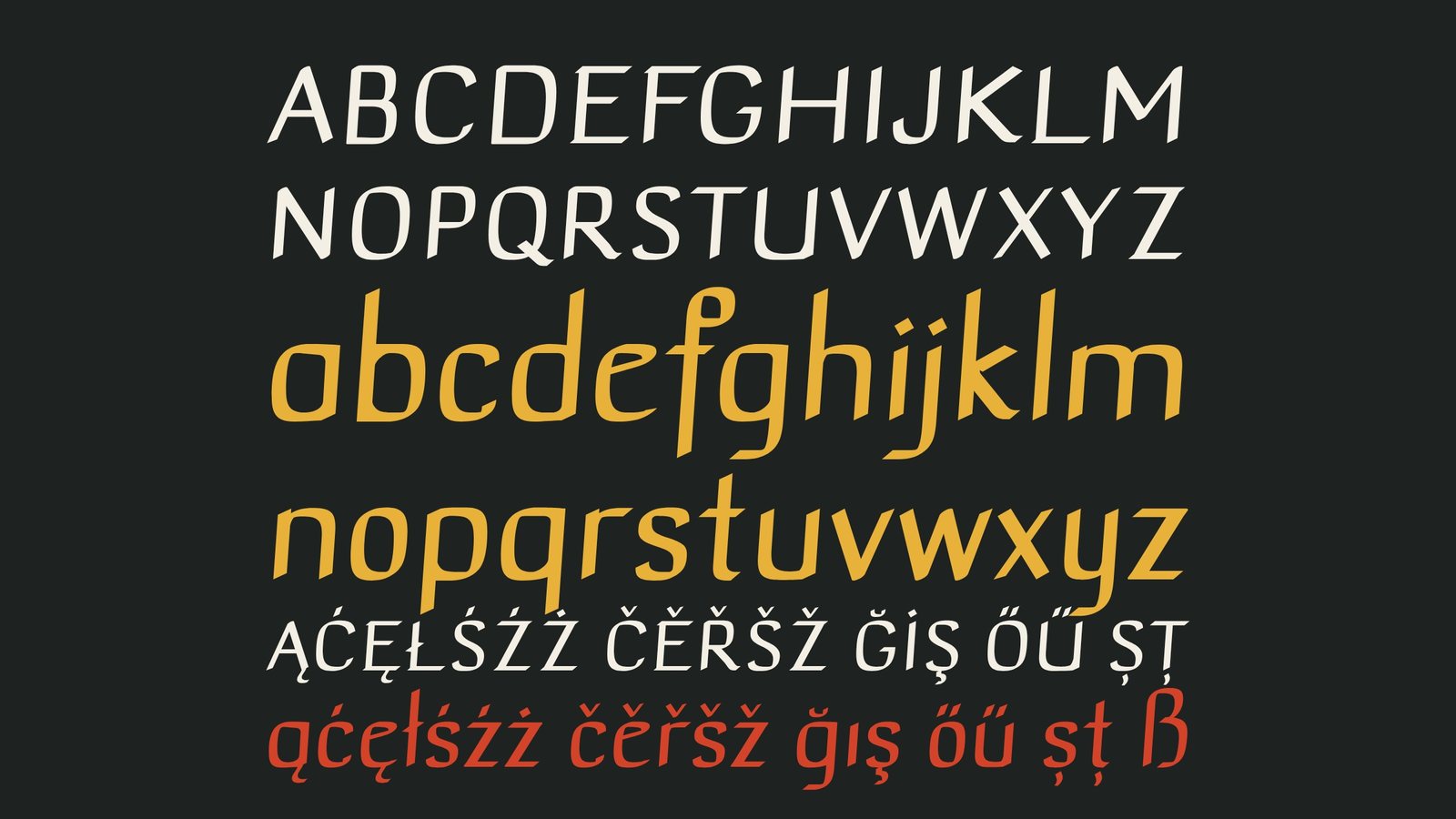
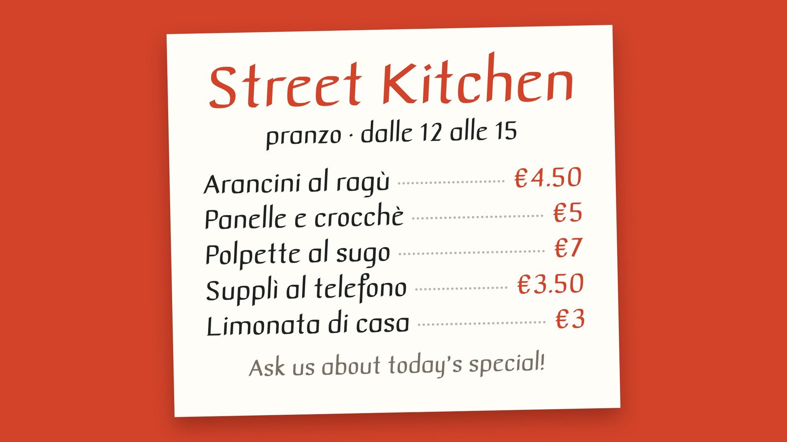
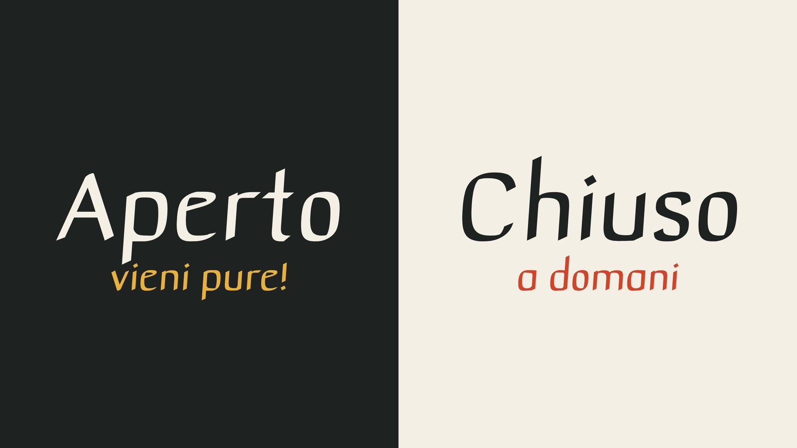
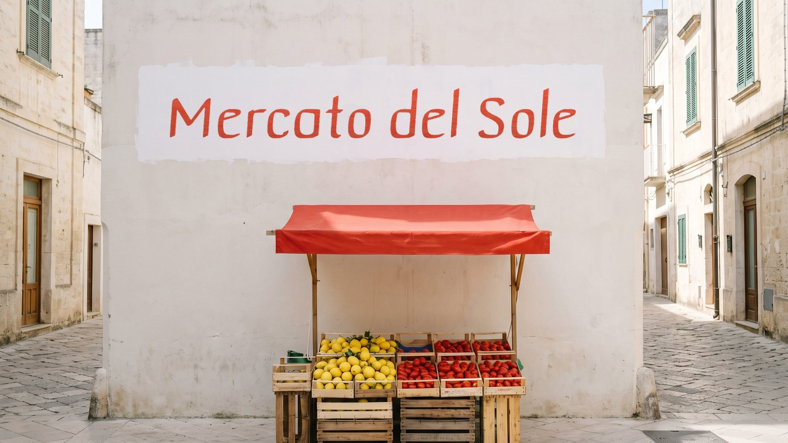
Spuntino is a casual display font. Its name is Italian for a snack, and its letters follow the quick marker lettering of café and street-food menu boards, so a word reads friendly and fast. It has the feel of the day's specials written up just before the doors open: relaxed, a little hurried, never stiff. Set it on menus, chalkboards, price tags, packaging and market posters.
Get Spuntino on MyFonts · Also on Fontspring · Also on Gumroad · Also on Etsy · Also on itch.io · Licence
- Style
- Regular
- Genre
- Casual marker display
- Languages
- 30, Latin script
- Best at
- 72 px and up
Condensed letters with a line of light.
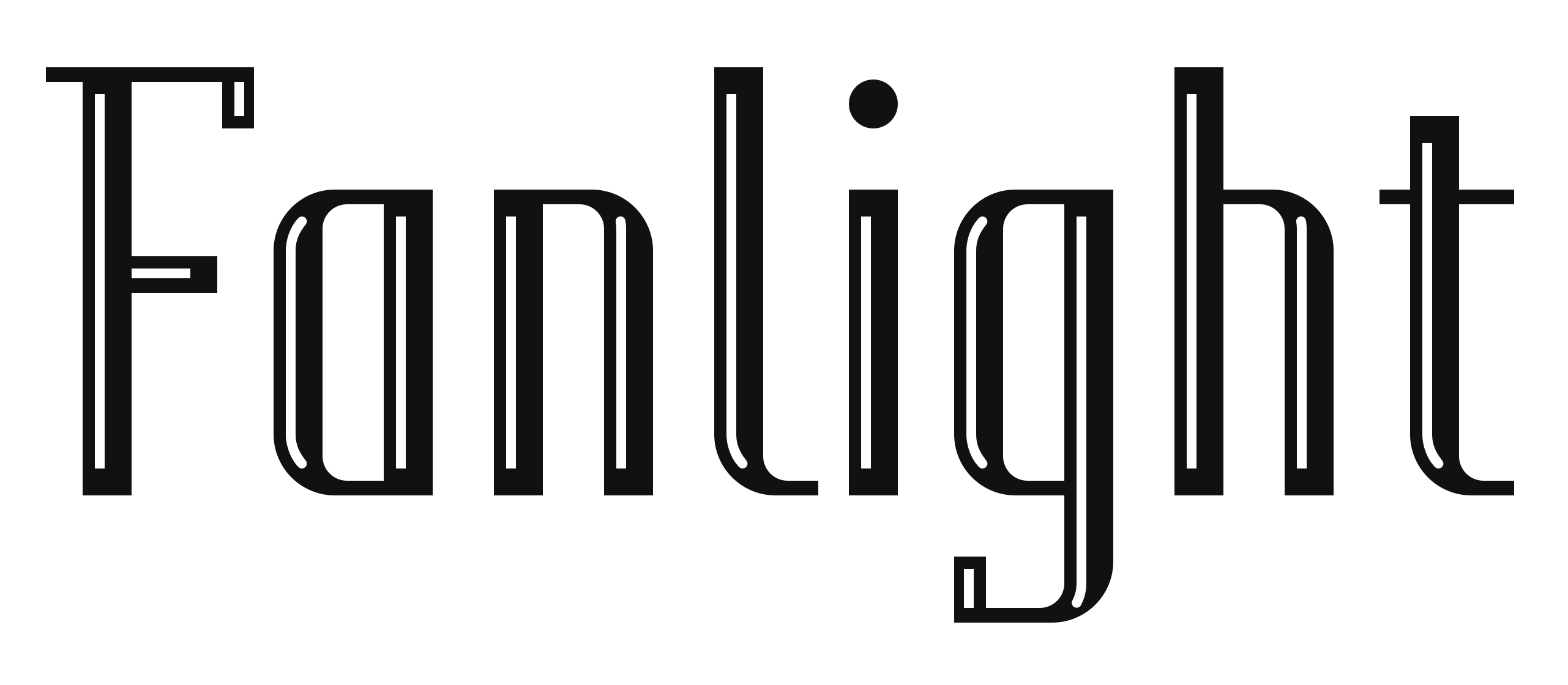
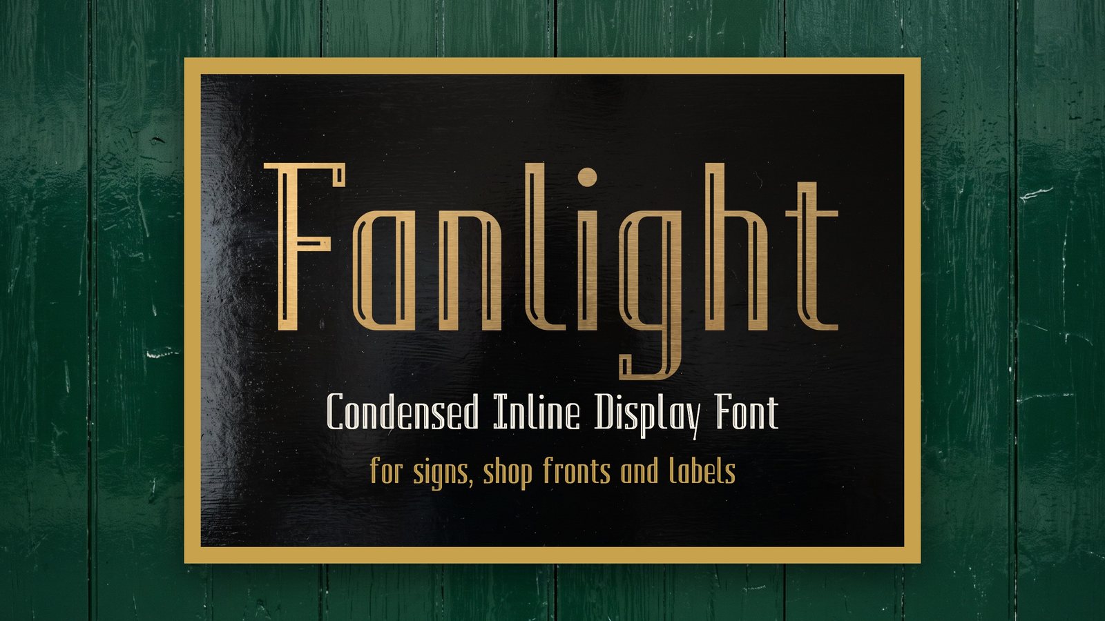
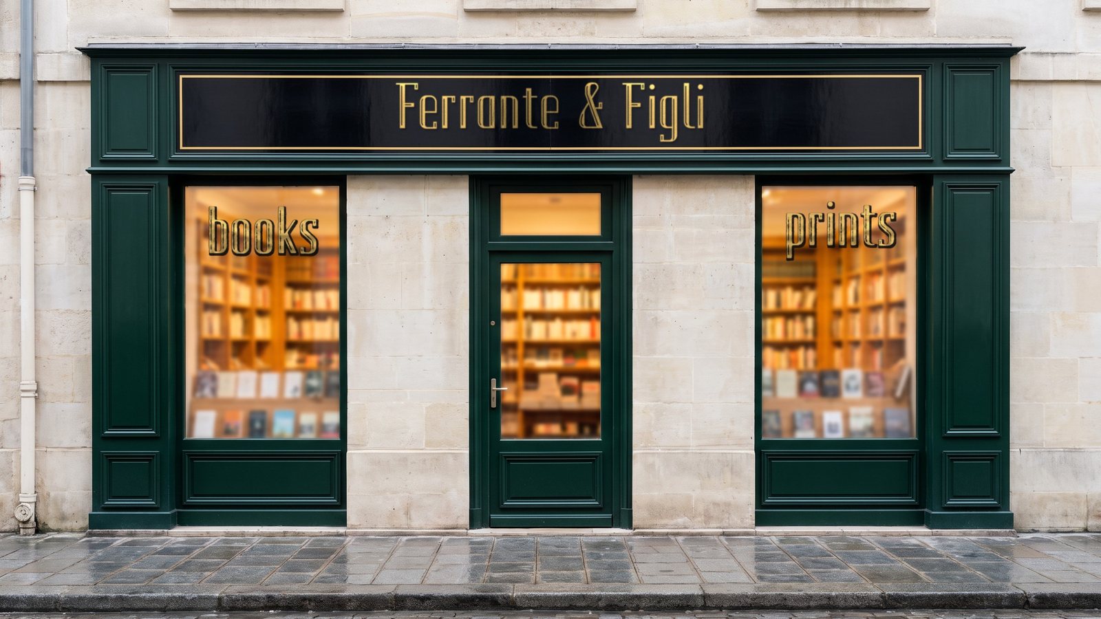
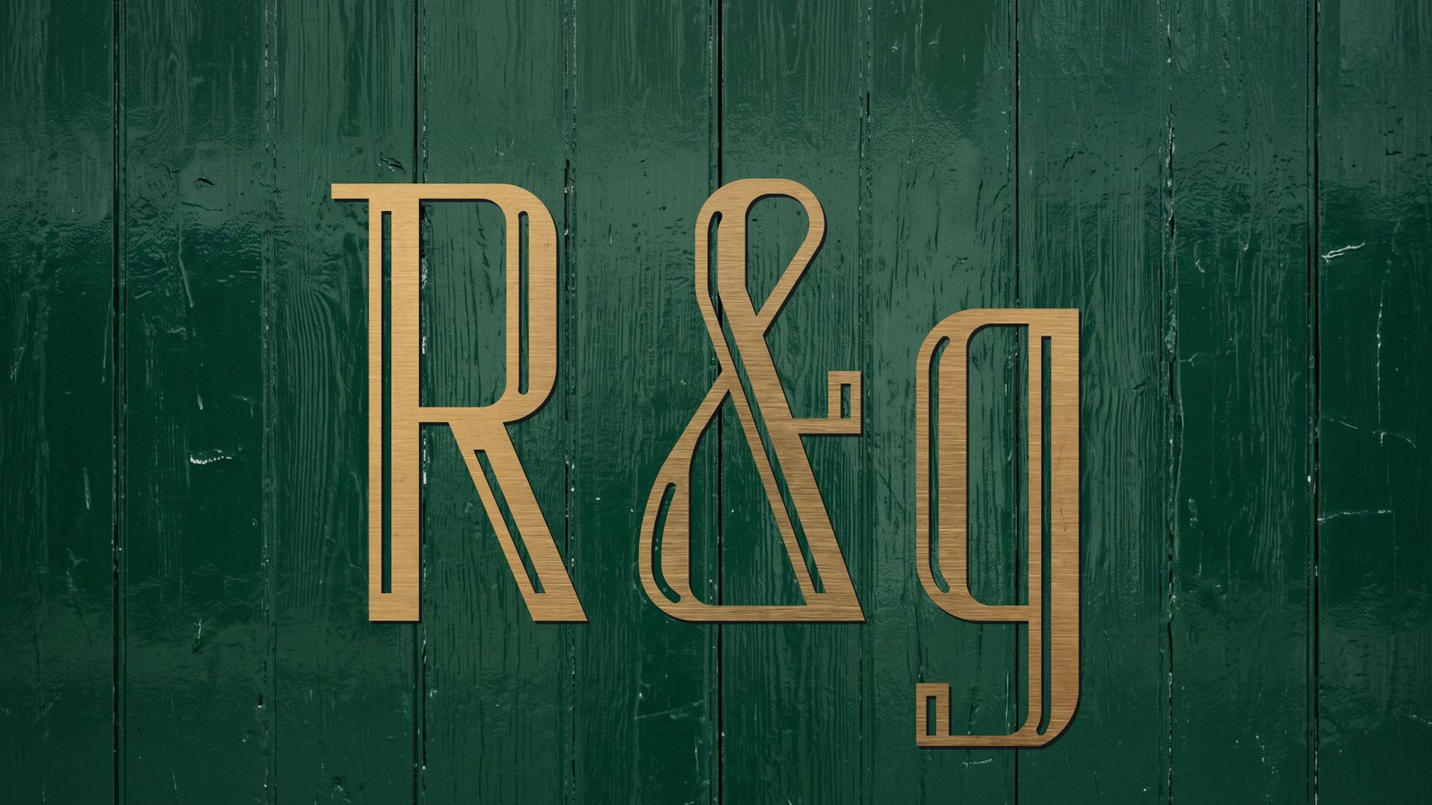
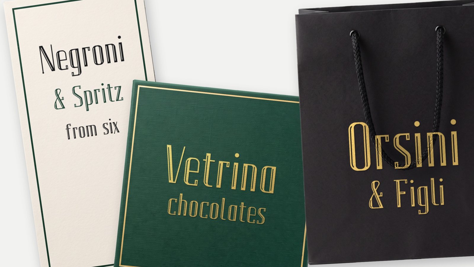
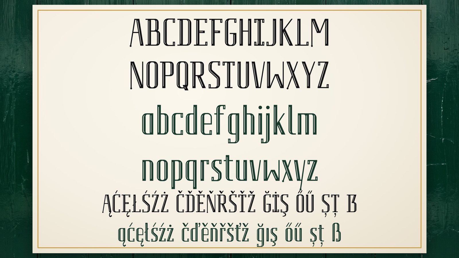
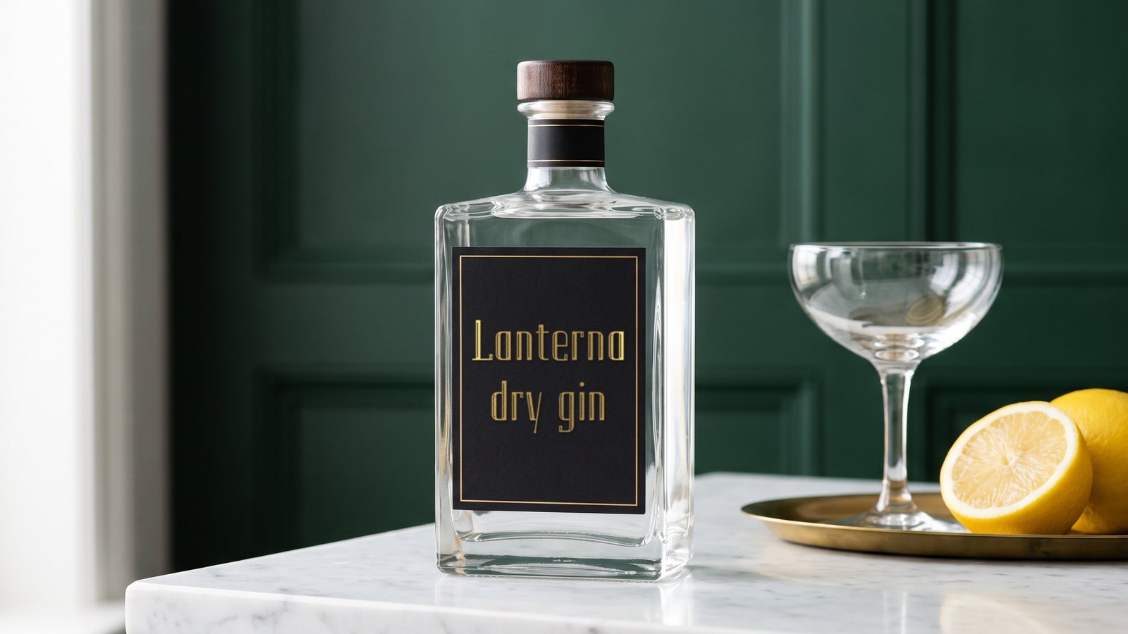
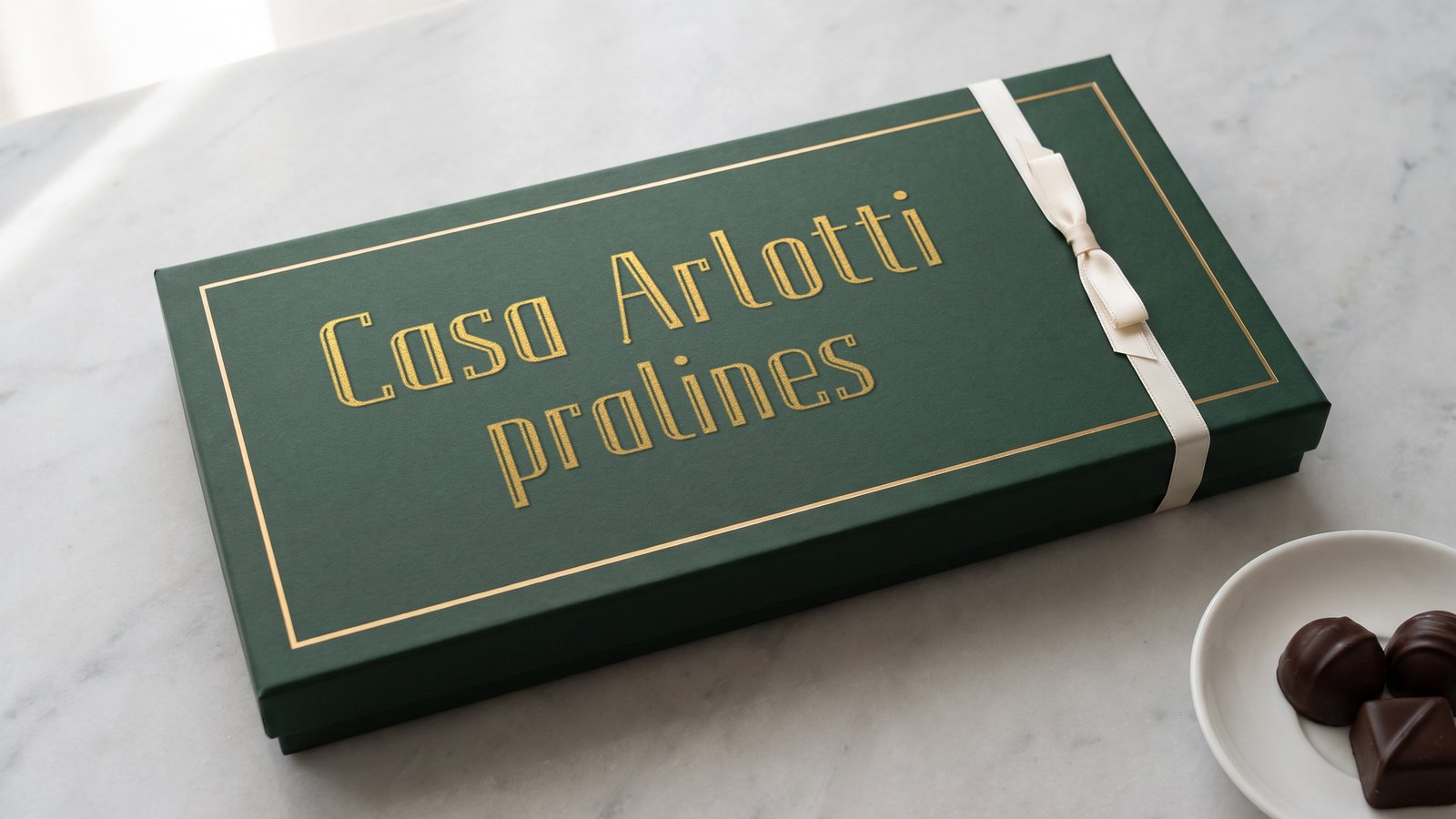
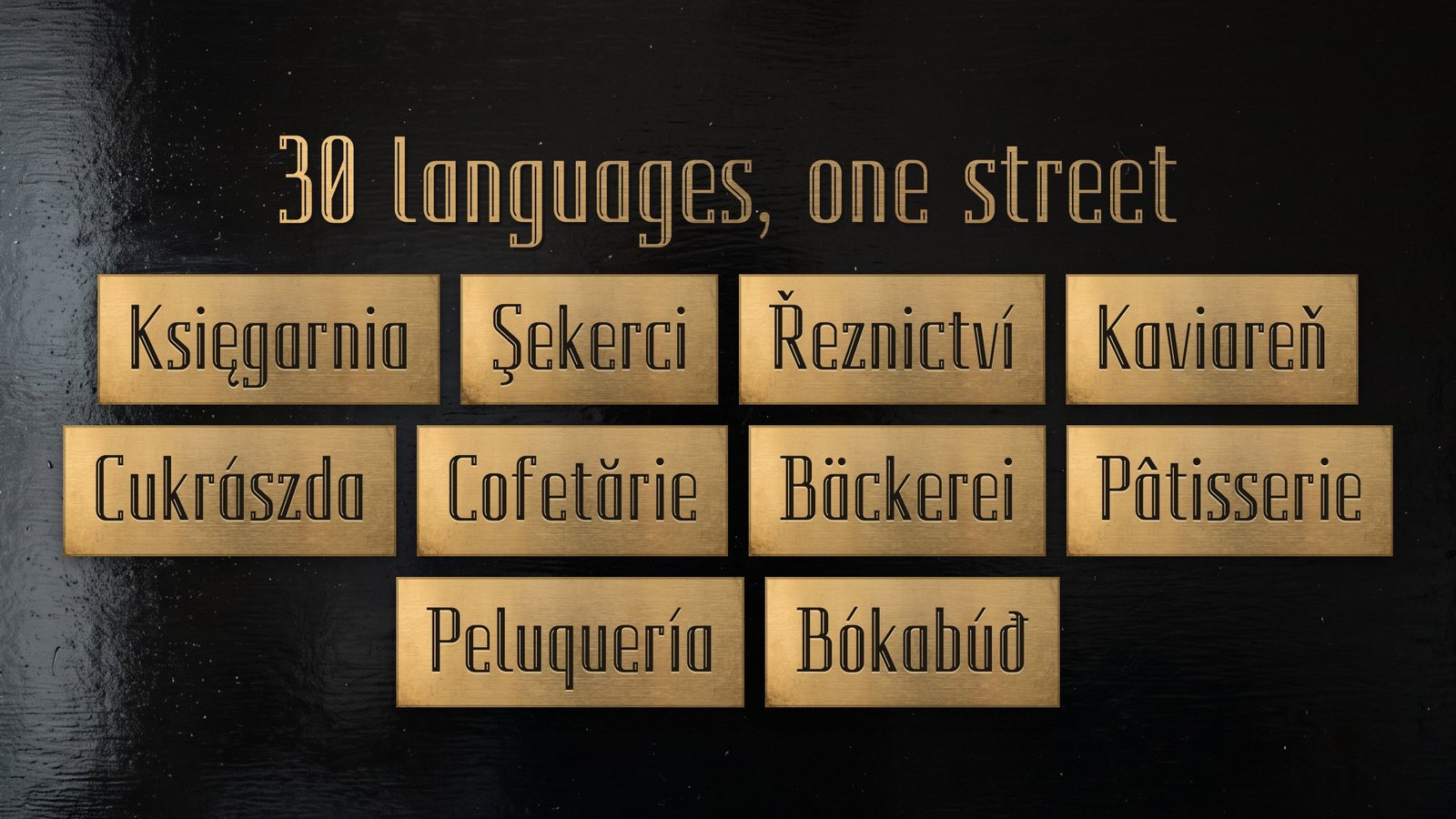
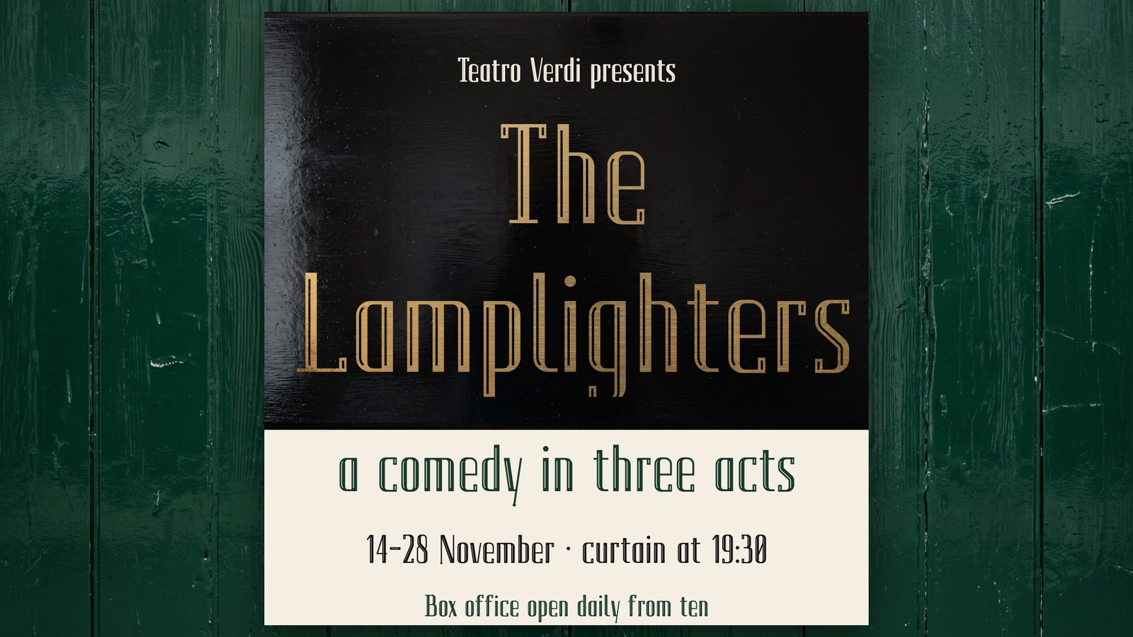
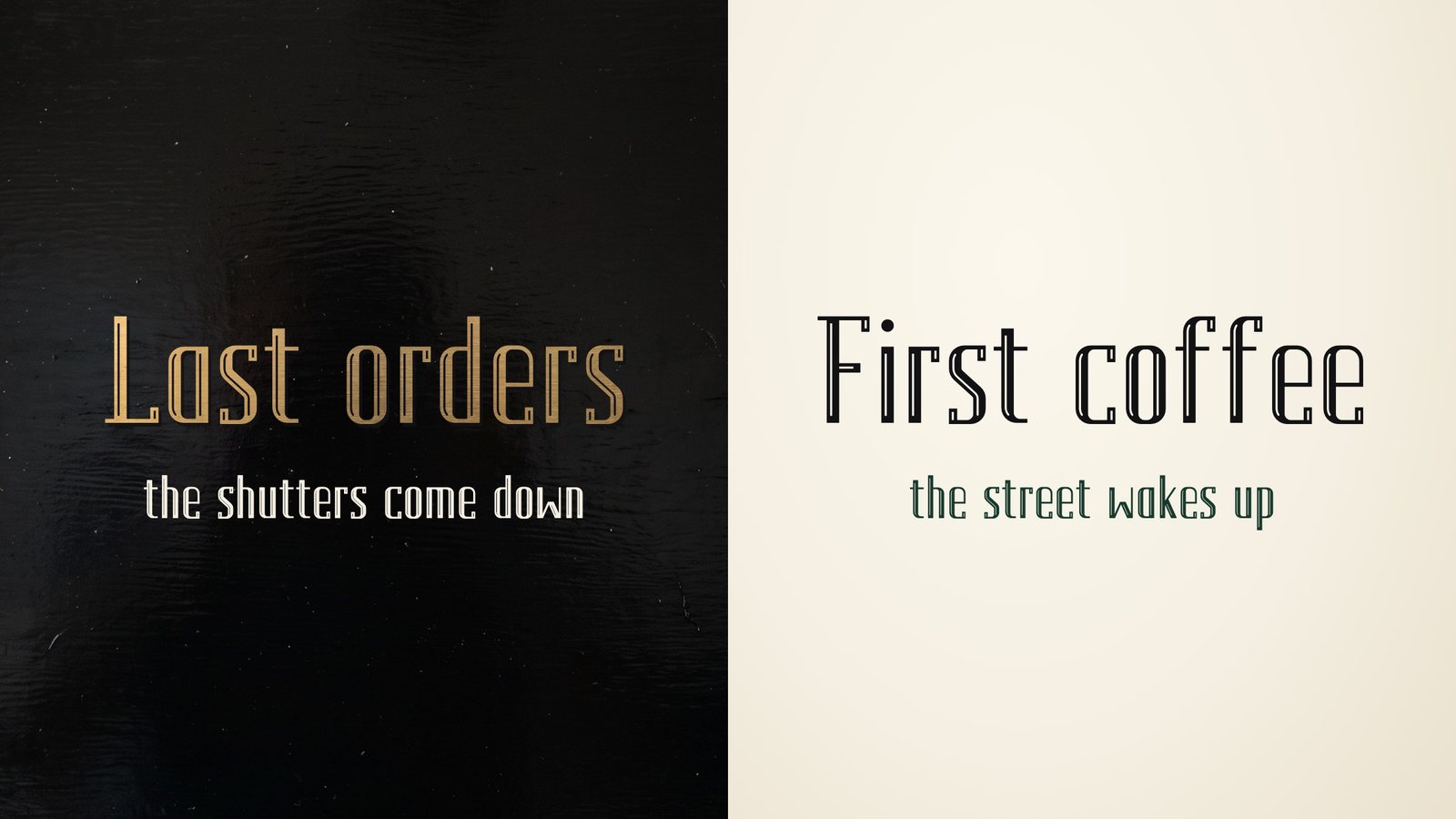
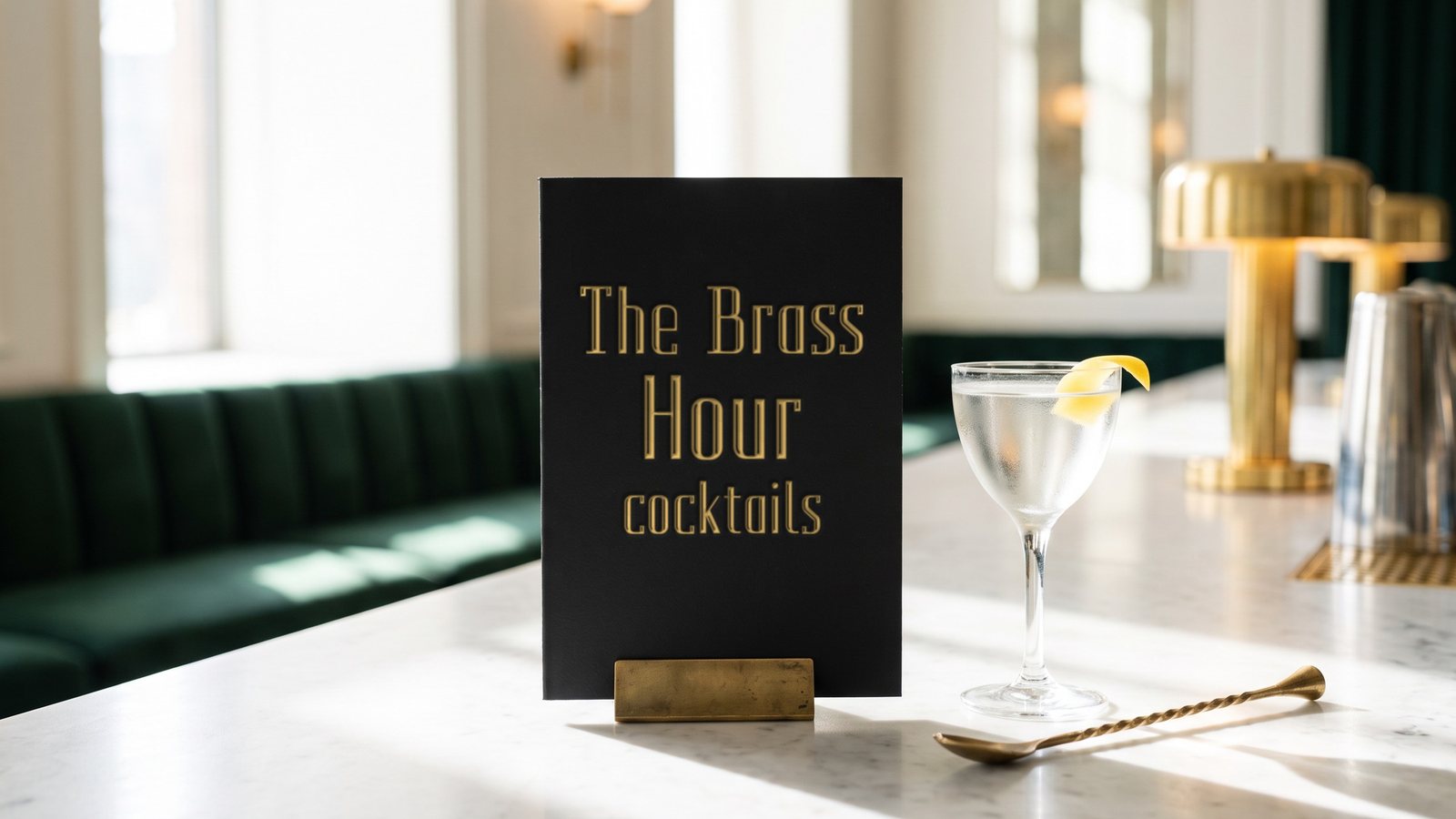
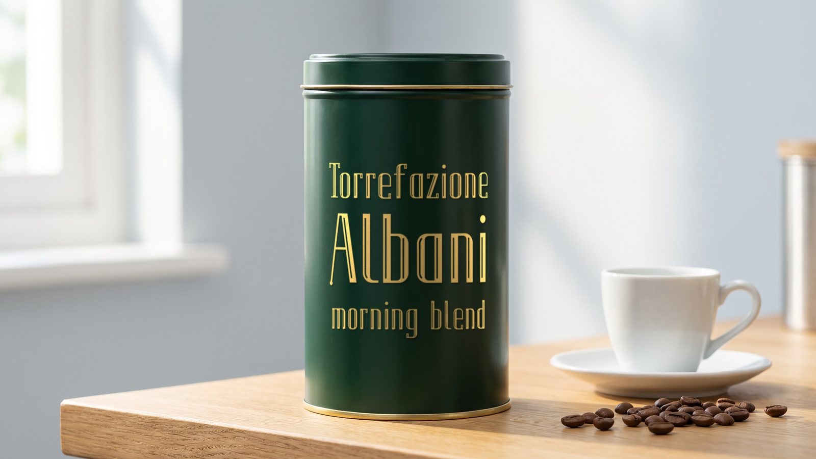
Fanlight is a condensed inline display font. A fanlight is the half-round window above an old shop door, often painted with the name of the shop, and the font comes from that sign-painting tradition: tall, narrow letters with a fine line of light running through them. One word set in Fanlight reads from across the street. Set it on signs, shop fronts, labels and packaging.
Get Fanlight on MyFonts · Also on Fontspring · Also on Gumroad · Also on Etsy · Licence
- Style
- Regular
- Genre
- Condensed inline display
- Languages
- 30, Latin script
- Best at
- 72 px and up
01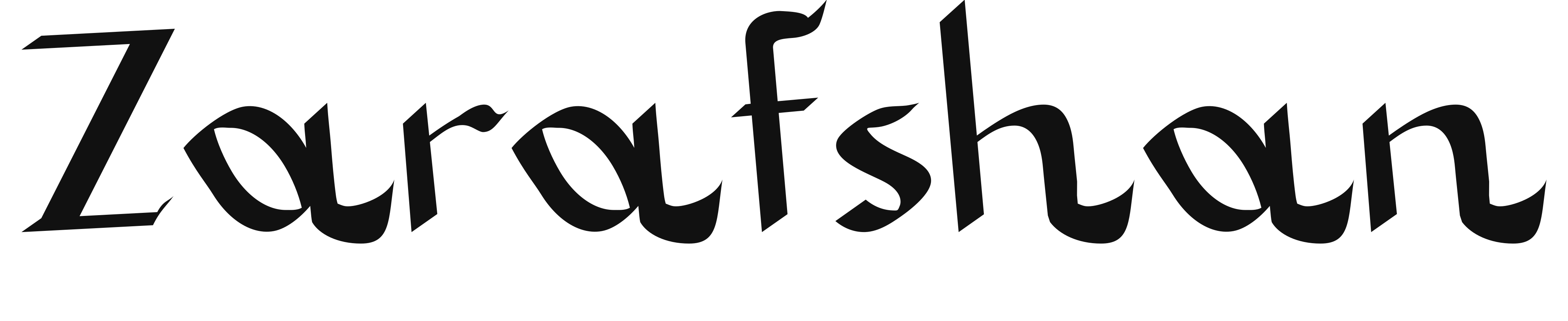
Available on MyFontsAvailable on FontspringAvailable on GumroadAvailable on EtsyAvailable on itch.io
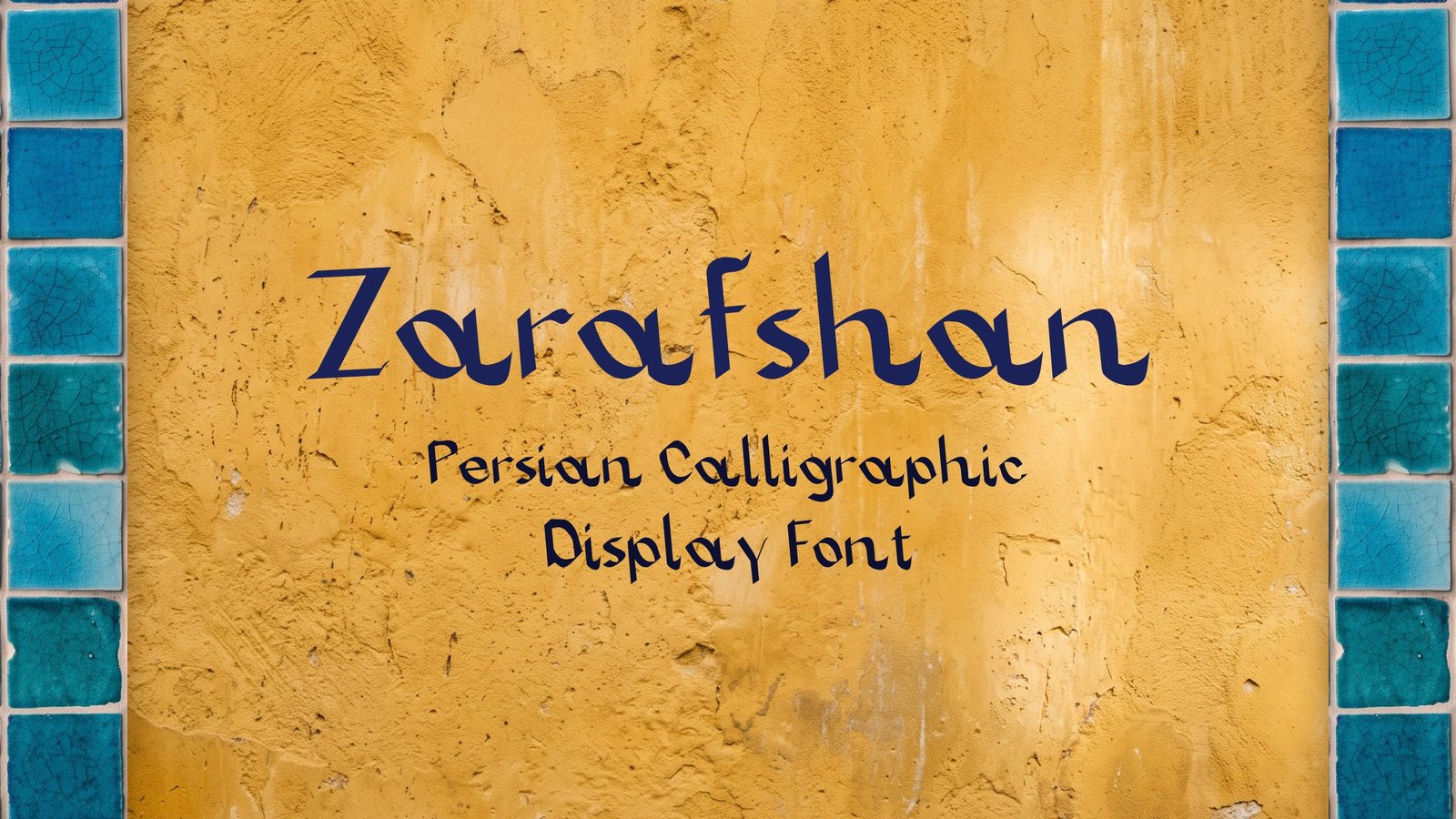
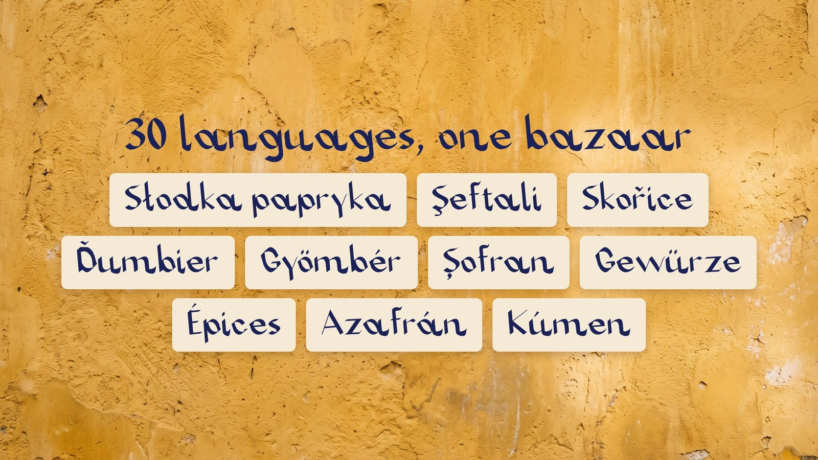
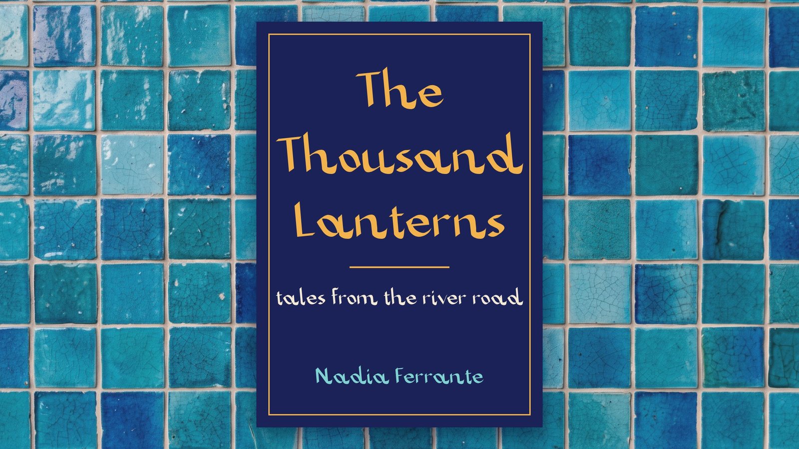
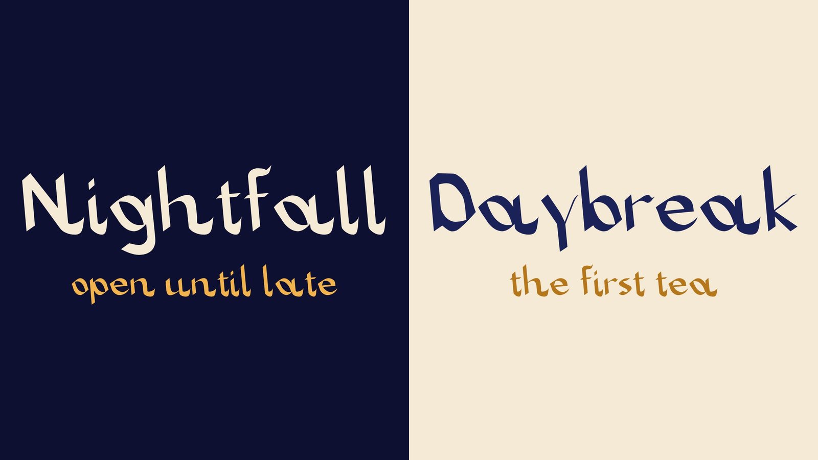
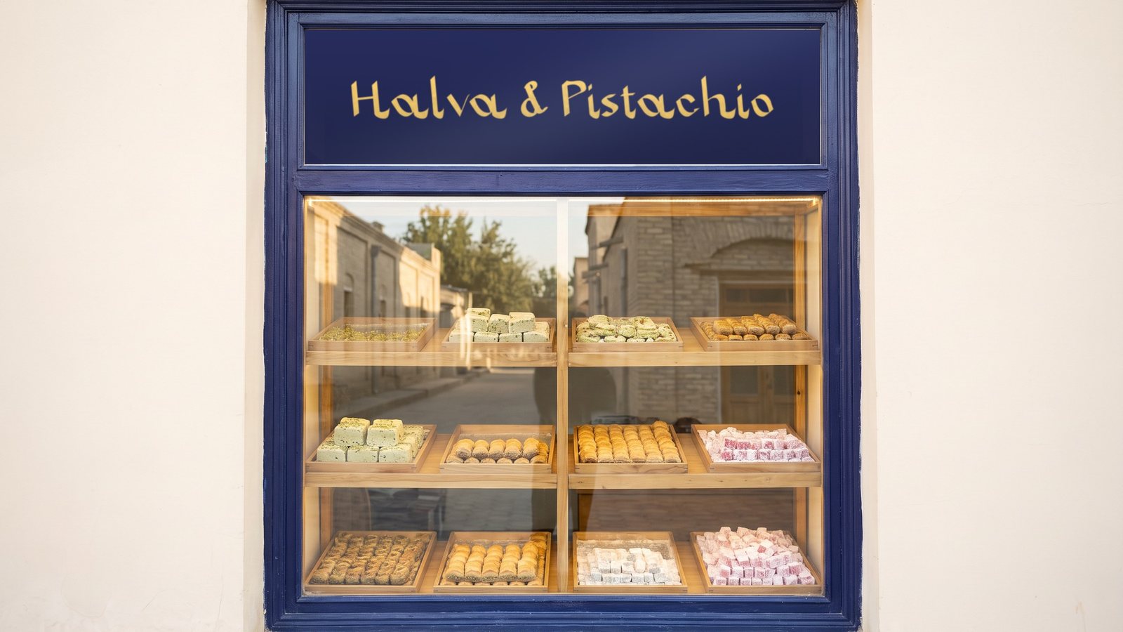
A Latin alphabet with a Persian accent.
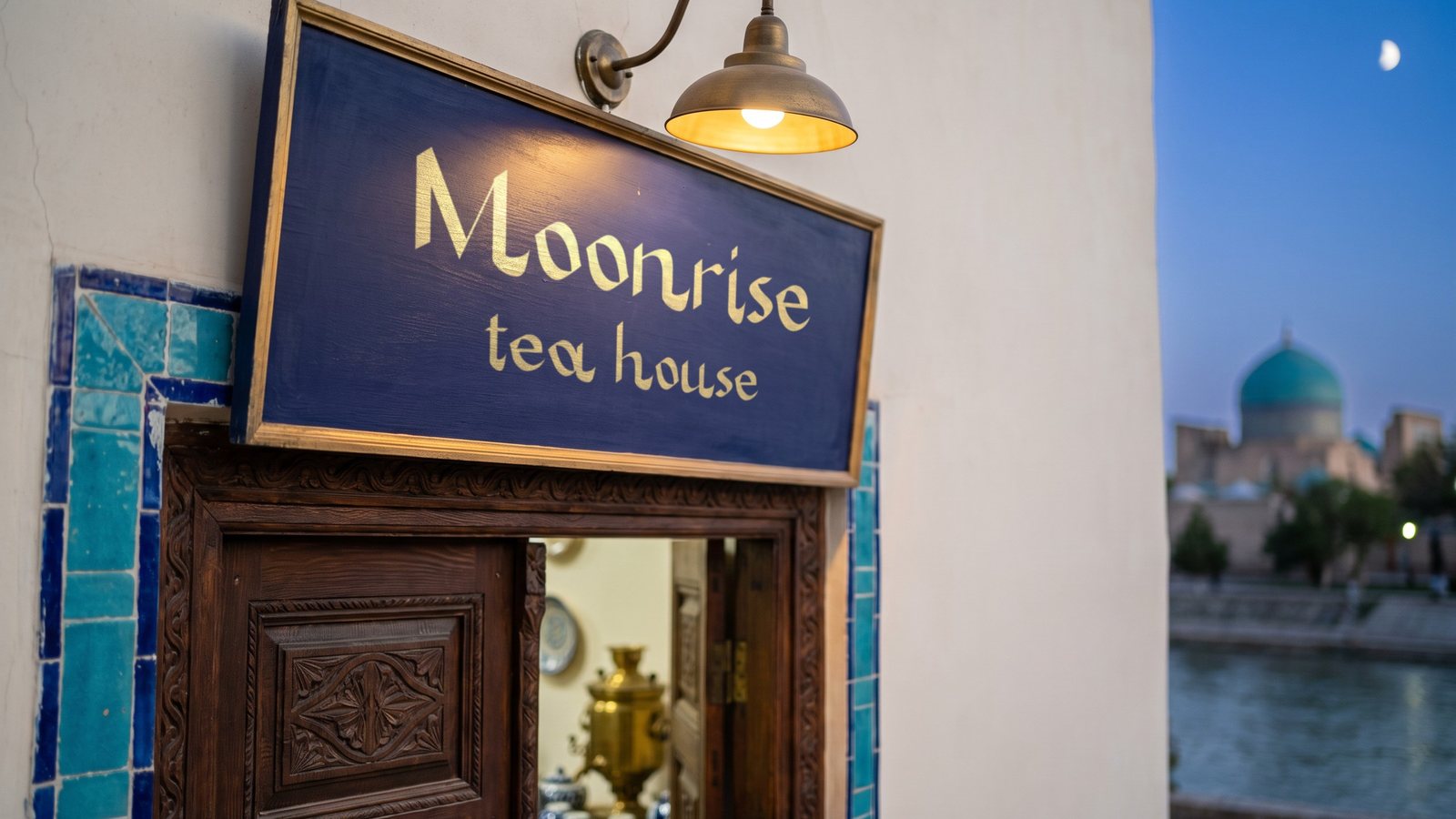
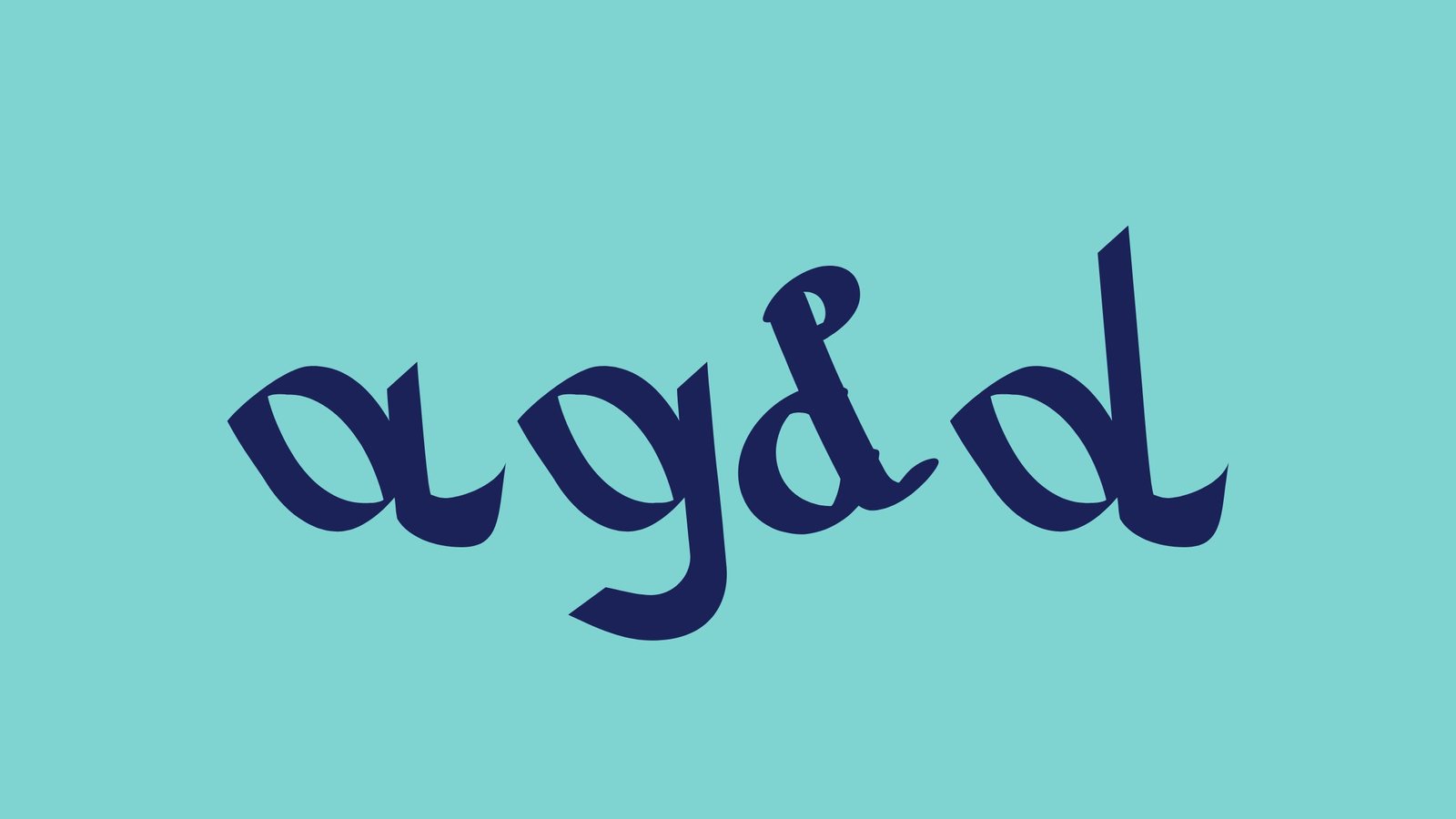
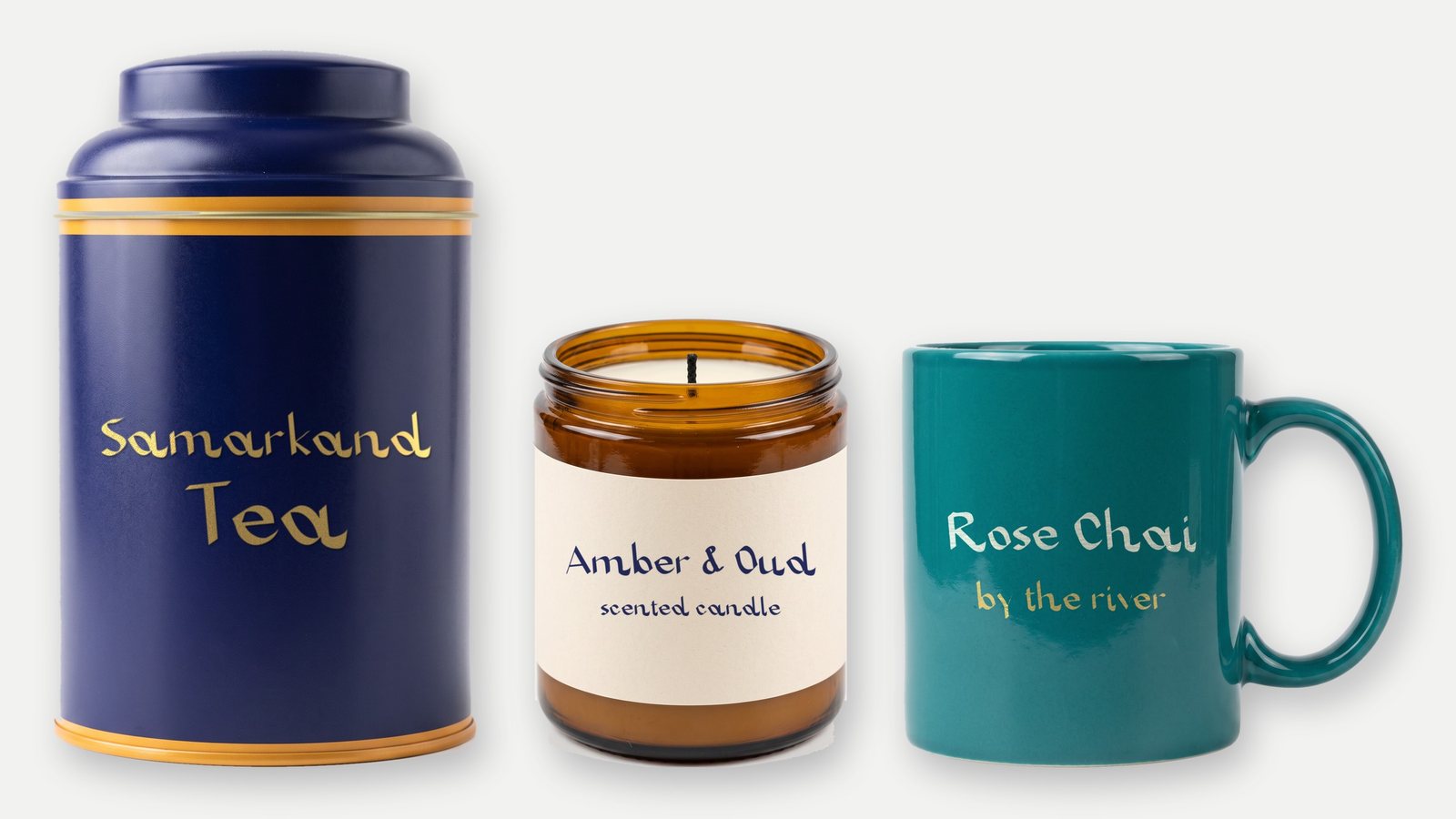
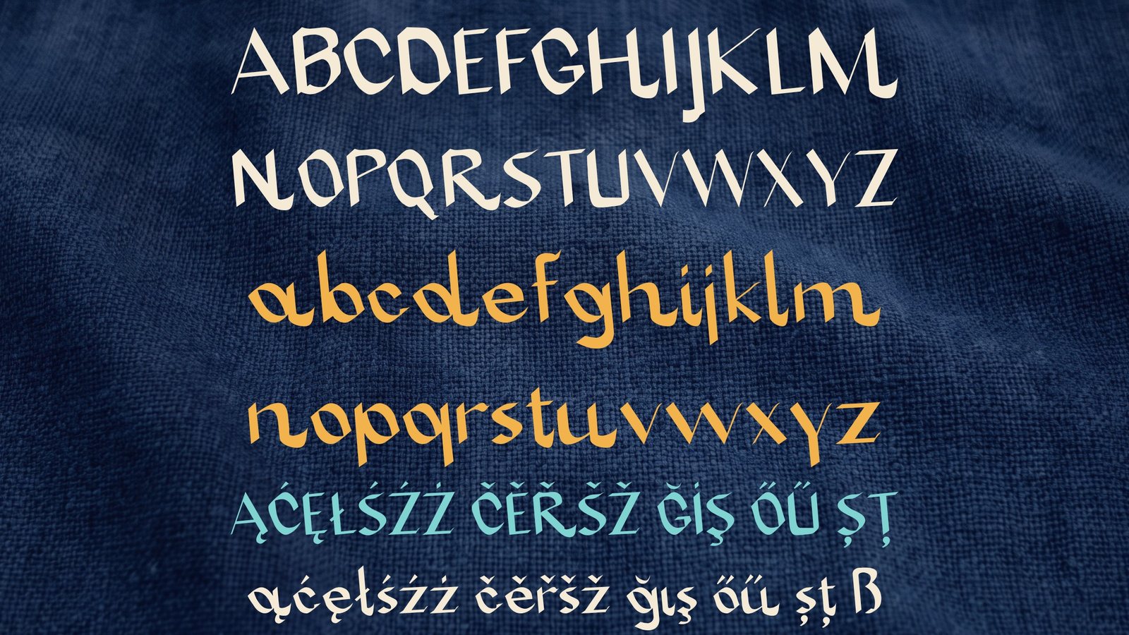
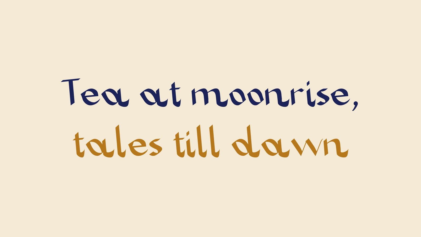
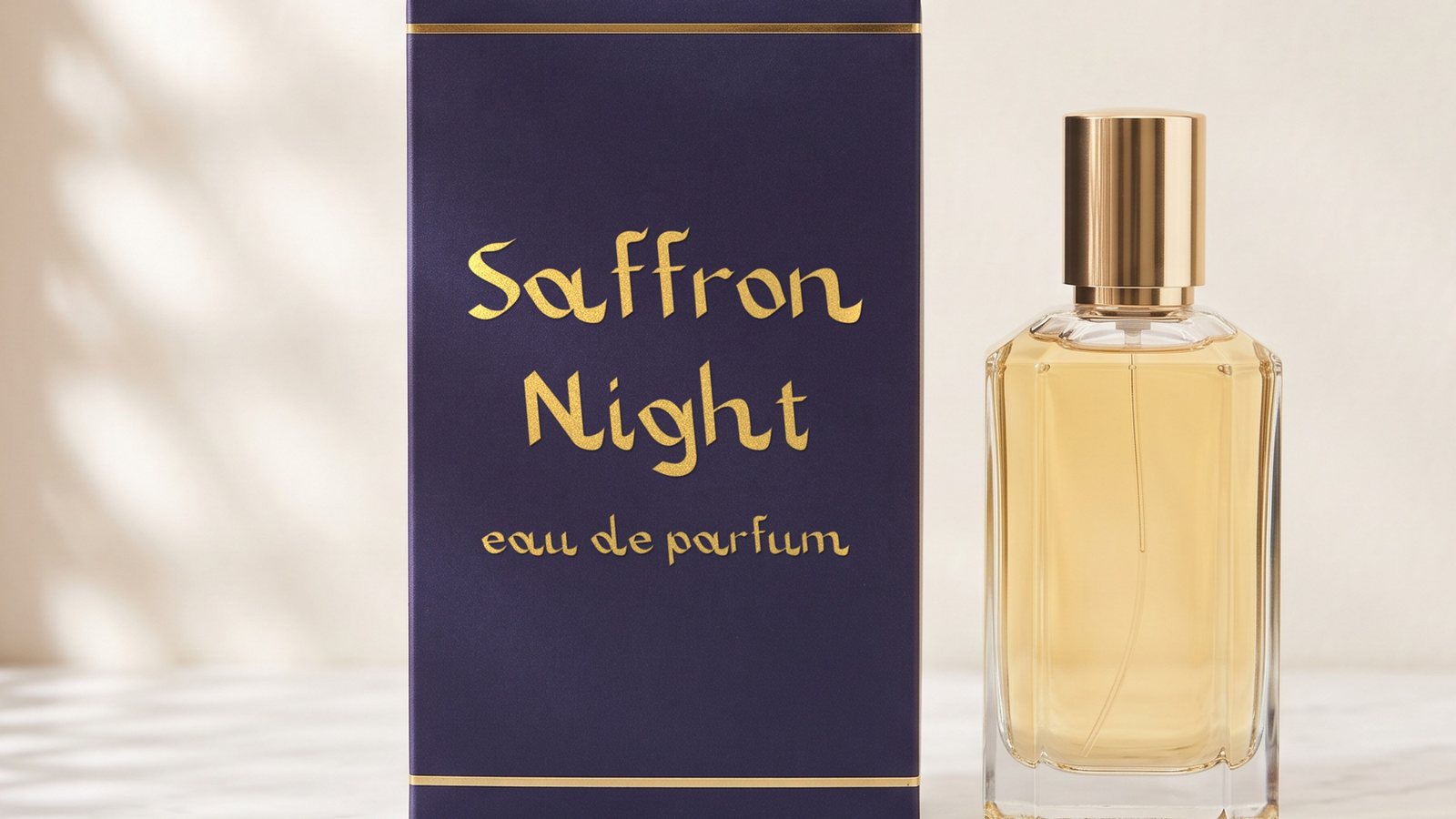
Zarafshan is a calligraphic display font. It is named after the river that runs past Samarkand, and it brings the rhythm of Persian calligraphy to the Latin alphabet: generous curves and an easy, flowing line give a single word the mood of an old tale. Set it large on book covers, posters, labels and menus.
Get Zarafshan on MyFonts · Also on Fontspring · Also on Gumroad · Also on Etsy · Also on itch.io · Licence
- Style
- Regular
- Genre
- Calligraphic display
- Languages
- 30, Latin script
- Best at
- 72 px and up
About
Taleggio Foundry is a small, independent type studio. Our name is Italian, and so is our taste. We draw display type in which a single word carries a whole mood.
- Typefaces
- 5 available
- Formats
- OTF, TTF, WOFF2
- Licences
- Desktop, Web, App, ePub